In this article
A familiar bear covered in a restless visual language
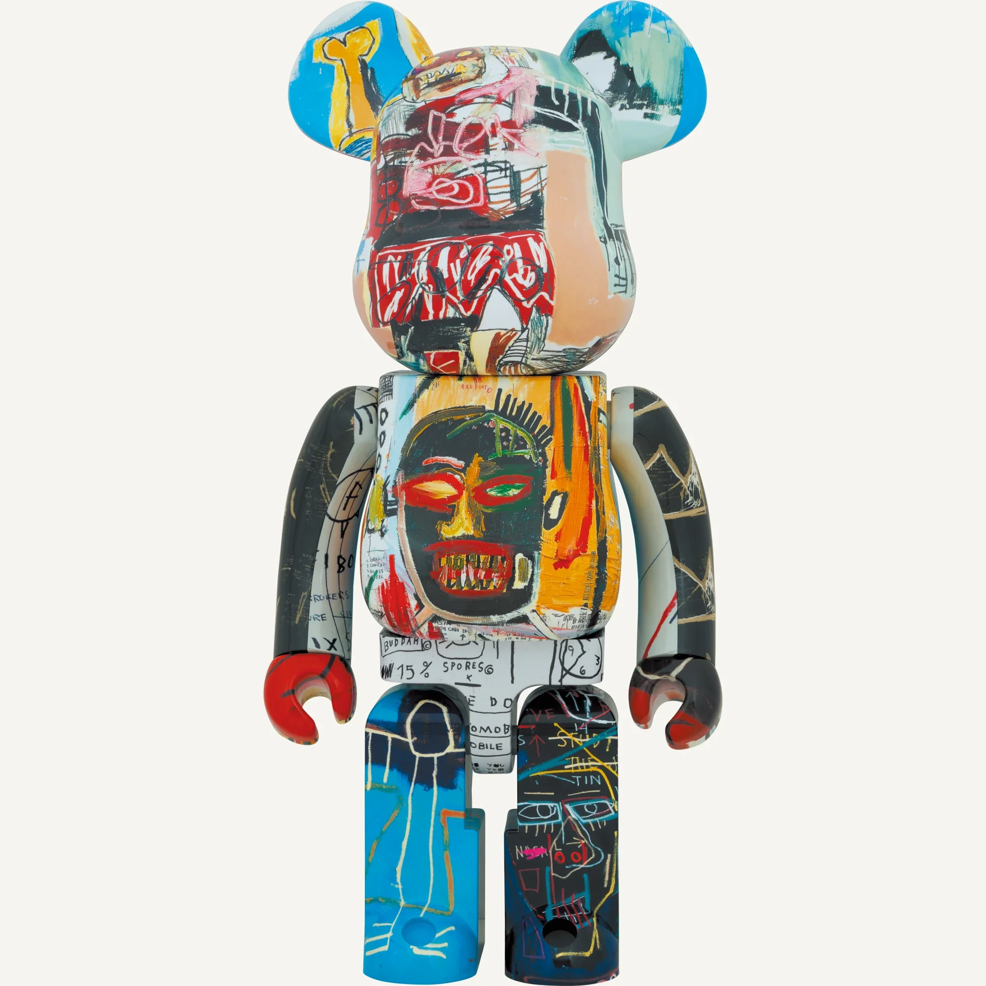
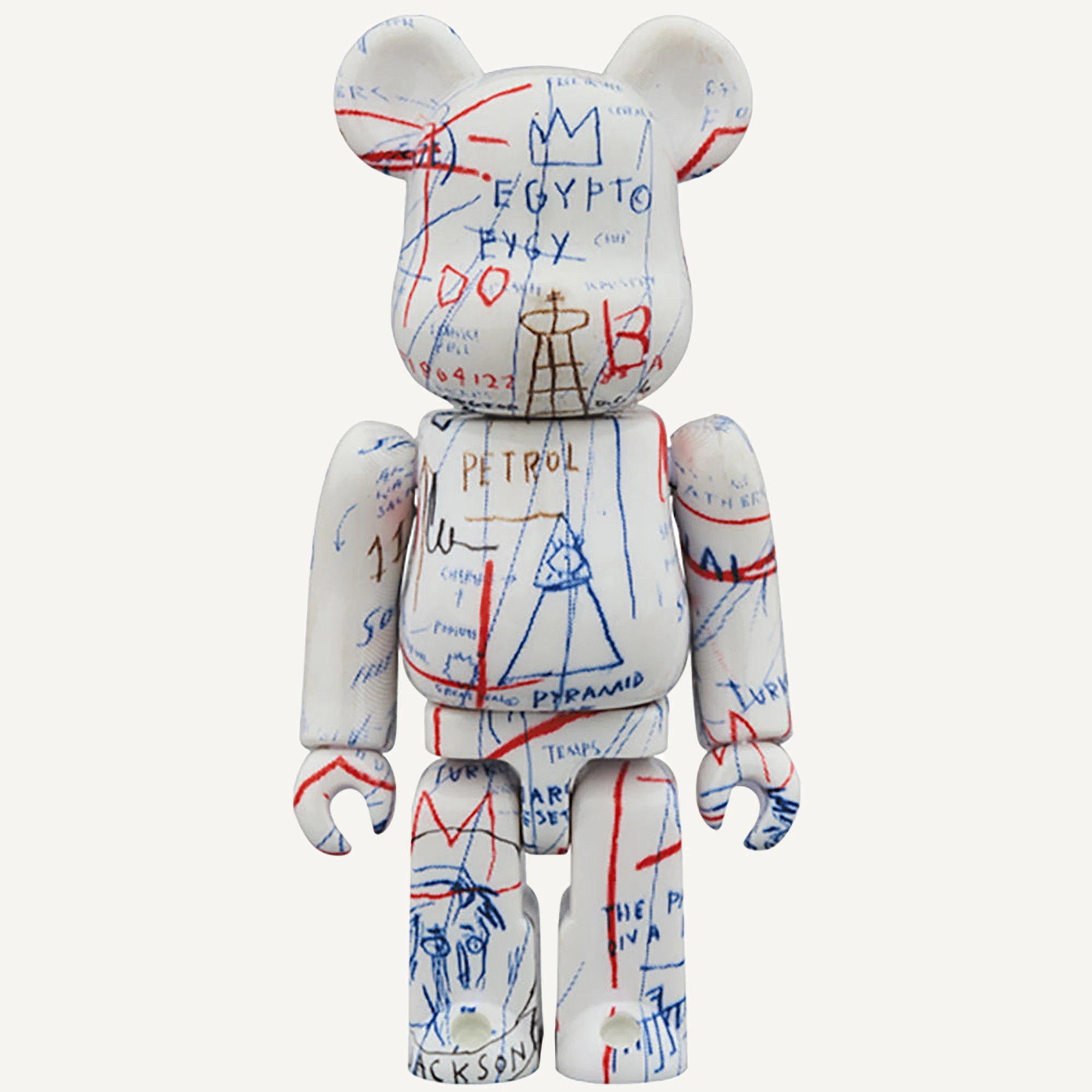
A Jean-Michel Basquiat BE@RBRICK can reward a second look before you have read its product name. Words cross the body, drawn figures break into fragments and a mark that looked incidental suddenly becomes the centre of attention. The bear’s outline stays familiar, but its surface asks to be read in pieces.
This is what makes the format interesting. A painting normally presents a surface in front of us; the bear divides that surface between a head, torso, arms and legs. Turning it changes the relationship between those parts.
The resulting collectible is a later licensed object. Its connection to Basquiat’s imagery is important, but it should be understood separately from an original painting, drawing or print.
Who Jean-Michel Basquiat was
Jean-Michel Basquiat lived from 1960 to 1988 and became a central figure in New York’s art scene during the 1980s. Reducing his work to a street-art aesthetic misses much of what makes it demanding: painting, drawing, text, music and historical references operate together.
The Fondation Louis Vuitton’s retrospective account traces a practice rich in fragmented writing, cultural references and different approaches to the human figure. A particular face or crown belongs within that wider field, rather than functioning as a universal logo with one fixed meaning.
A BE@RBRICK can offer an accessible encounter with those images. It is also a reason to look beyond the object and discover the work from which its visual language comes.
Crowns, words and the body
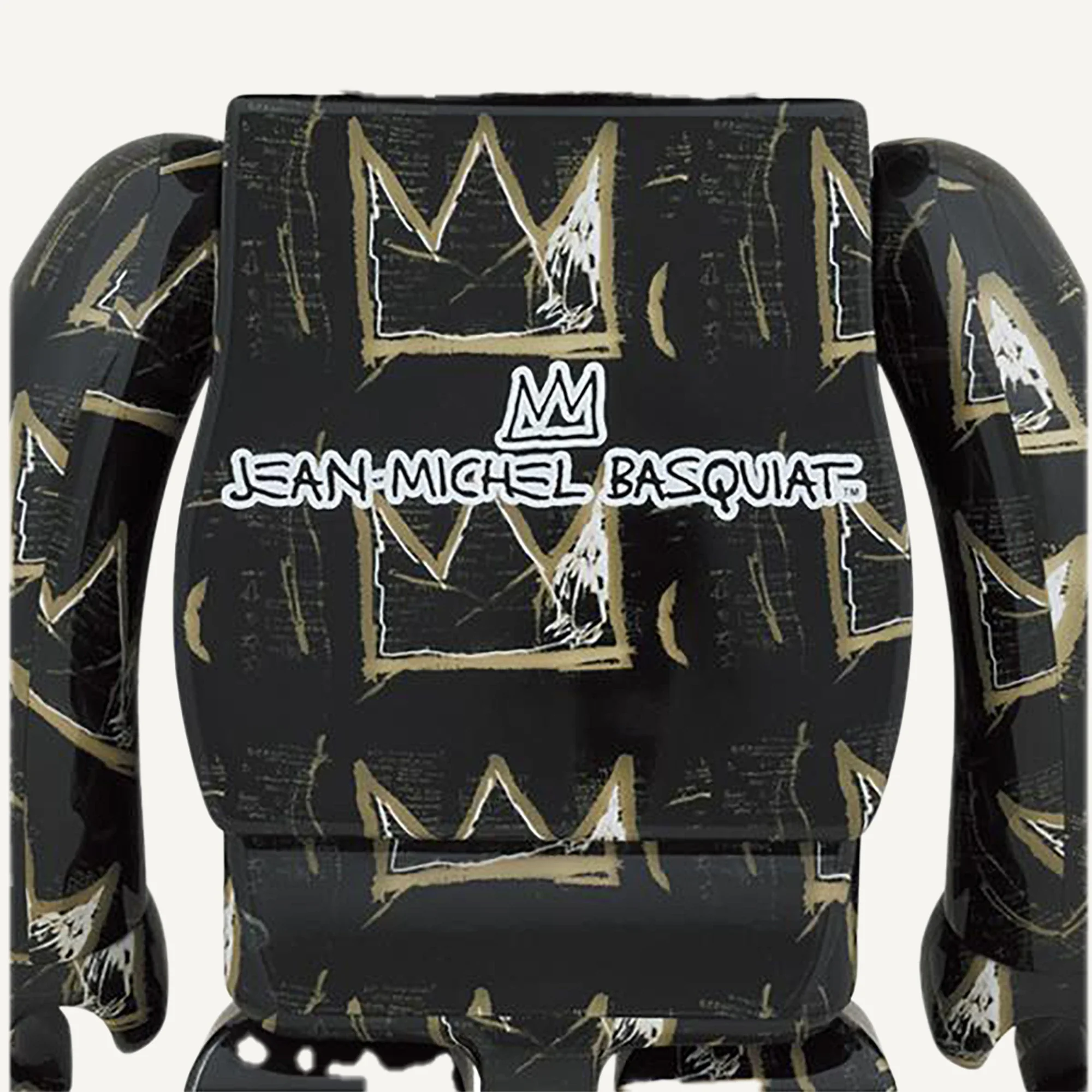
Crowns, anatomical forms, faces and written fragments are among the elements a viewer may recognise in Basquiat’s work. They do not all appear on every figure, nor should they be treated as a simple code in which one sign always means the same thing.
Start by looking at what is actually present. Does a word remain readable, or does it break as it passes around a limb? Is a face the centre of the design, or one part of a denser surface? These are observations about the object in front of you.
The bear’s geometry adds another layer. A detail may disappear at the shoulder and reappear on the back, encouraging a slower, less frontal way of looking than a single catalogue photograph suggests.
The role of the estate and licensing
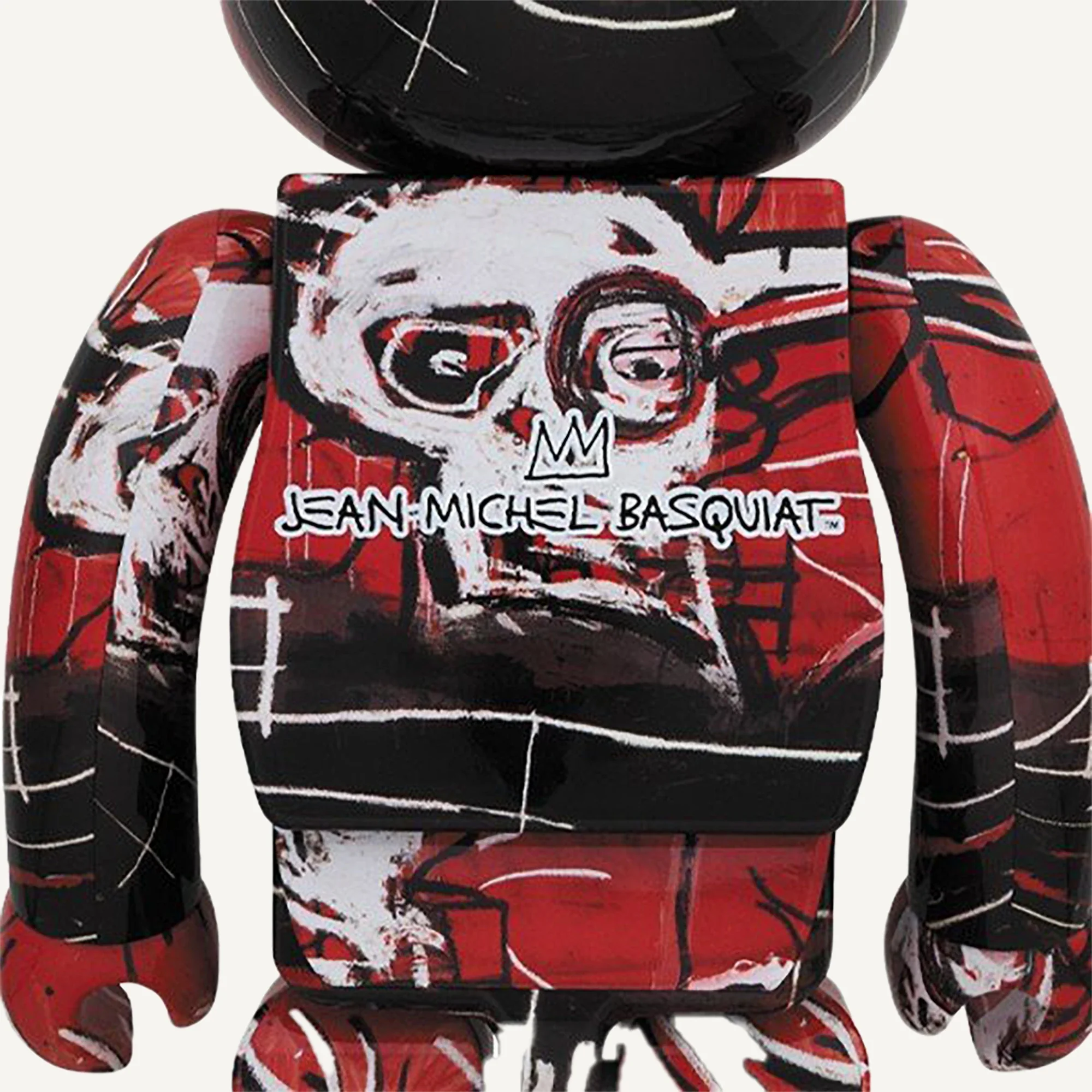
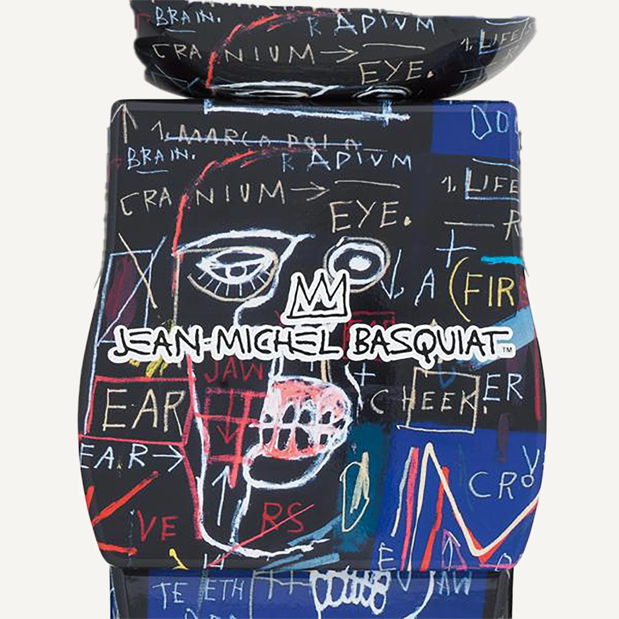
Basquiat died in 1988, before BE@RBRICK launched in 2001. These releases therefore do not represent a personal collaboration between the artist and MEDICOM TOY. They belong to the authorised use of his artistic legacy on a later collectible platform.
Official MEDICOM TOY listings identify the Estate of Jean-Michel Basquiat and licensing by Artestar, New York. This information establishes the rights context of the manufactured product; it is not a claim that Basquiat designed the bear or supervised its production.
For a collector, precise language makes the relationship more useful rather than less meaningful. The artwork imagery, the rights holder and the manufacturer each have a different role in how the object came to exist.
Numbered versions are different designs
MEDICOM TOY documents several numbered Basquiat versions. The official archive includes #7 in 1000%, followed by other separately identified designs such as #8 and #9. These names help distinguish releases within a continuing family.
They are not edition counts. A figure called #9 is not, on that basis, one of nine examples. The number also does not tell you the retail price, rarity or exact original painting reproduced. Those questions need their own evidence.
Compare the whole design, not just one recognisable symbol. Colour areas, writing, figures and their distribution across the back can make two releases feel very different even when both carry the same artist’s name.
The early MEDICOM archive scheduled the unnumbered release for January 2018 and version #2 for October that year. Later store announcements listed 17 April 2021 for #7 and 17 July 2021 for #8. Preorders could start earlier, so an order date should not automatically be treated as the date collectors received the figure.
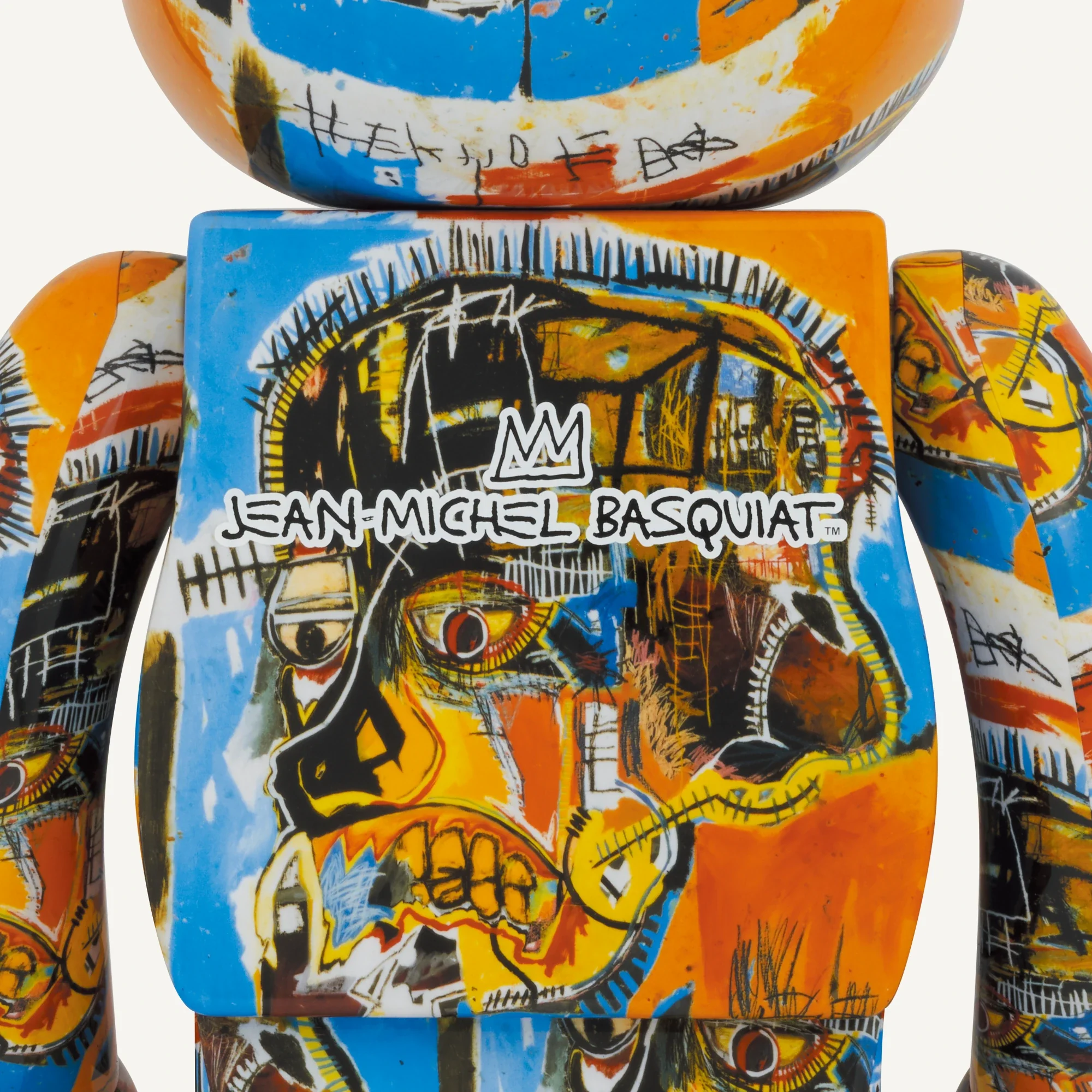
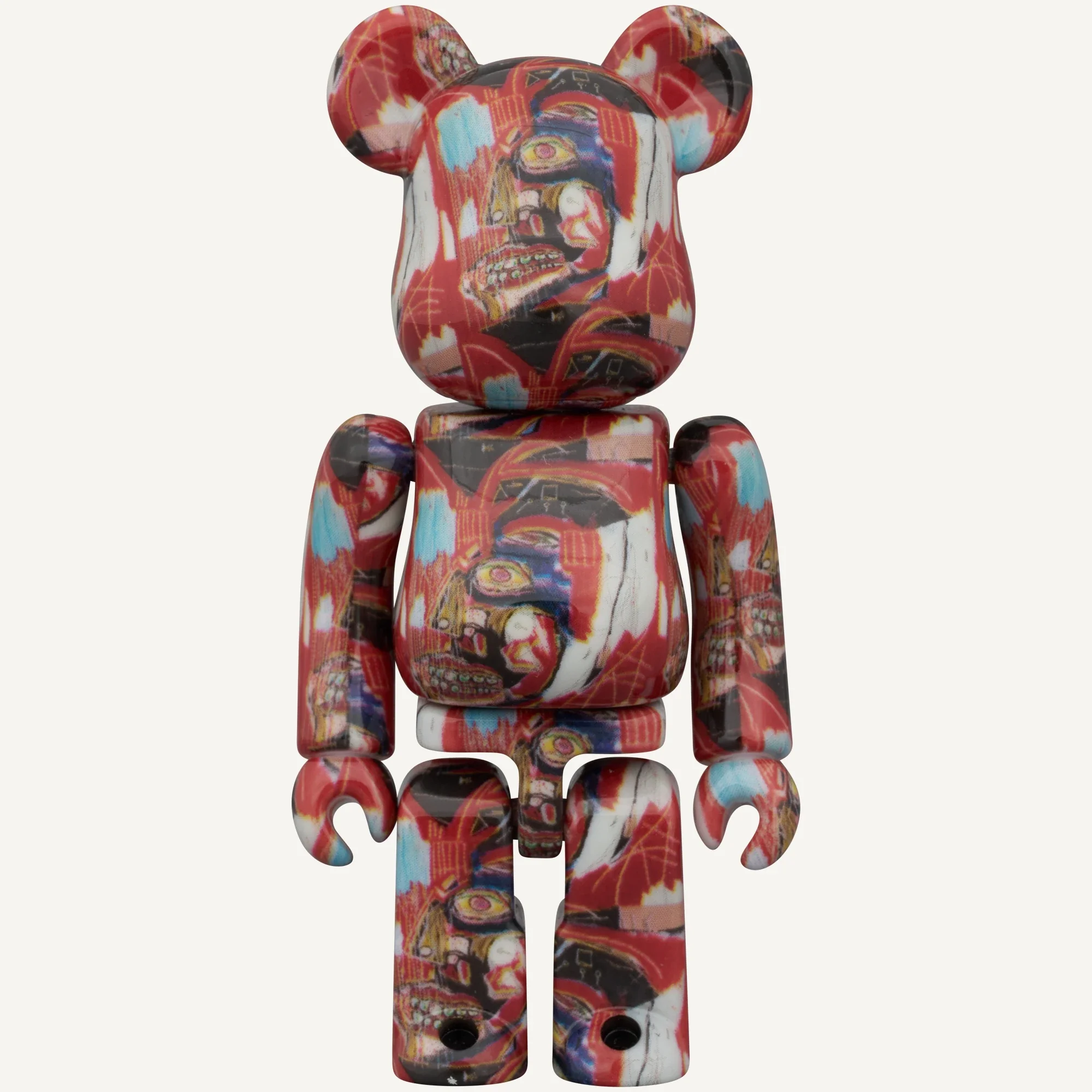
The differences become clear in specific examples: #2 has a pale surface with multicoloured lettering, while #5 uses a red-and-black composition with faces. #7 centres on a blue field; #8 pairs a black surface with repeated crowns. #10 carries a yellow-and-blue head motif, while the 13th Ver. returns to a red ground and another composition. These are distinct designs on one platform rather than six colours of the same bear.
The numbered line: from the first release to 14th Ver.
Each entry below identifies a separate design or line. Formats follow MEDICOM TOY archive listings. Basquiat 14th Ver. is scheduled for March 2027 and remains an announced future release.
Basquiat 1–14
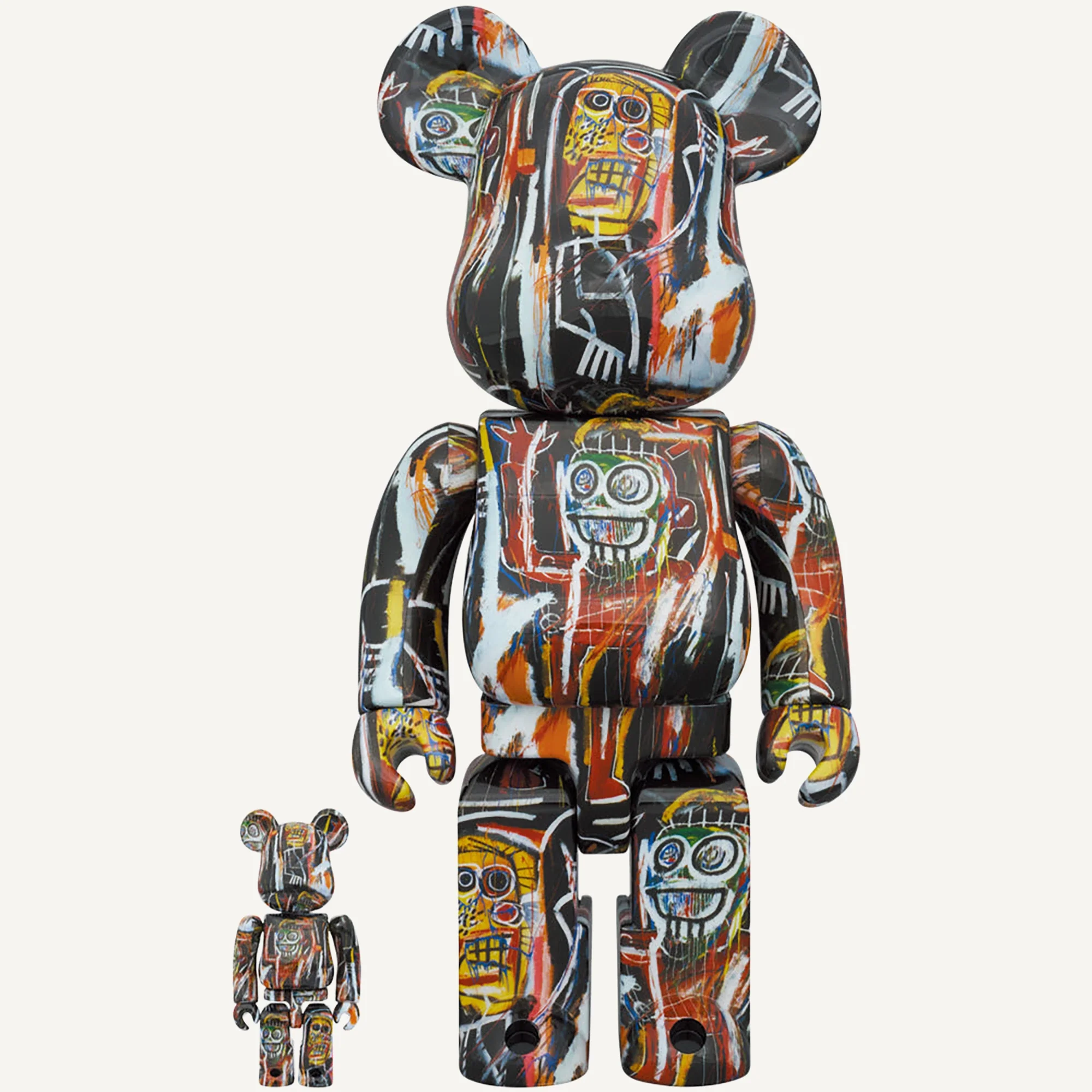
The first Basquiat release — unnumbered
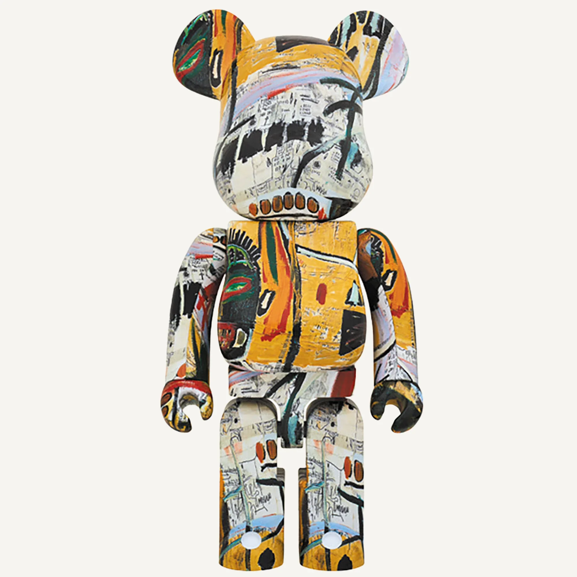
The early unnumbered design combines yellow-ochre areas with dense black-and-white drawing and fragments of faces. Its archive gives a planned January 2018 release, not an edition of one.
Archived formats: 100% + 400% (announced schedule: January 2018); 1000% (announced schedule: January 2018).
BE@RBRICK JEAN-MICHEL BASQUIAT #2
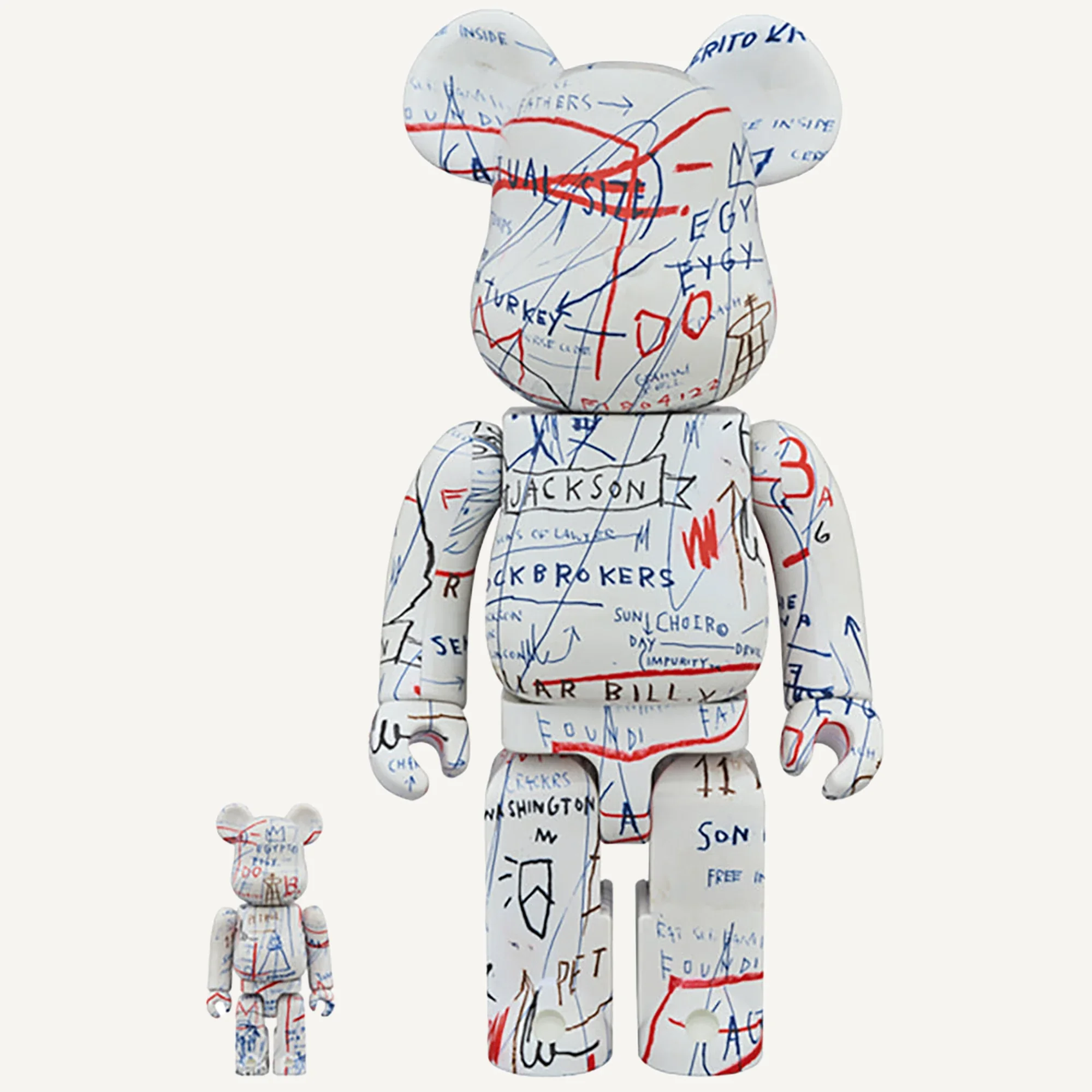
A light surface carries thin blue, red and black writing. Compared with the first design, the words and crossing lines create a more open graphic rhythm.
Archived formats: 1000% (announced schedule: October 2018); 100% + 400% (announced schedule: October 2018).
BE@RBRICK JEAN-MICHEL BASQUIAT #3
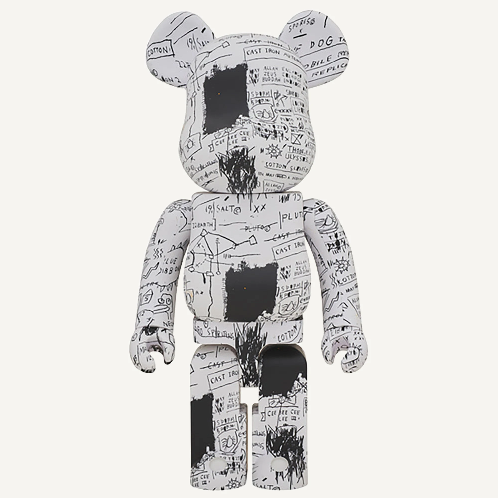
This nearly monochrome design combines small words, diagram-like lines and larger black patches. Its dense black-and-white surface distinguishes it from the more open coloured writing of #2.
Archived formats: 1000% (announced schedule: July 2019); 100% + 400% (announced schedule: July 2019).
BE@RBRICK JEAN-MICHEL BASQUIAT #4
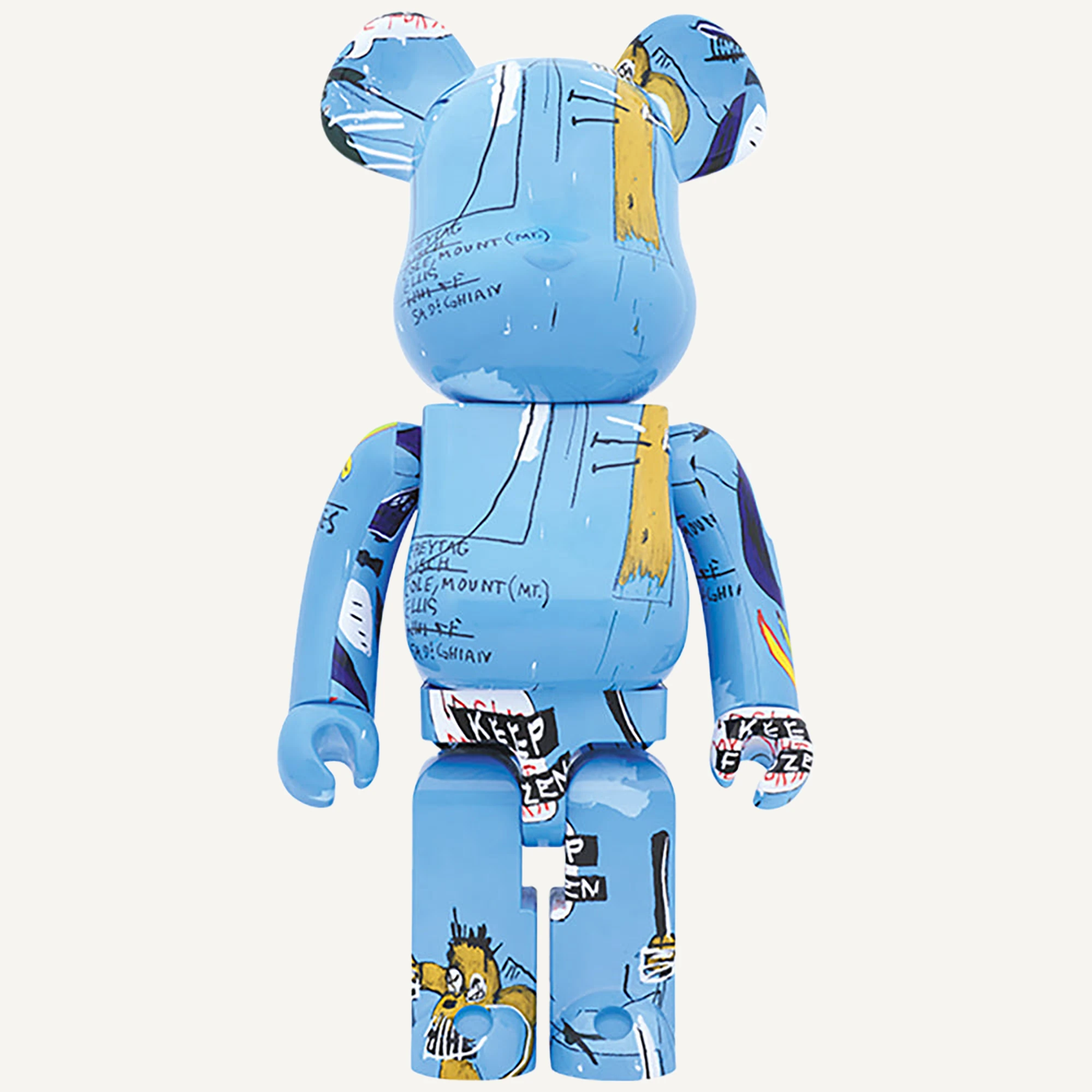
A blue ground brings together fine dark lines, white strokes and yellow accents. Unlike monochrome #3, its overall colour becomes apparent before individual words and figure fragments.
Archived formats: 1000% (announced schedule: October 2019); 100% + 400% (announced schedule: October 2019).
BE@RBRICK JEAN-MICHEL BASQUIAT #5
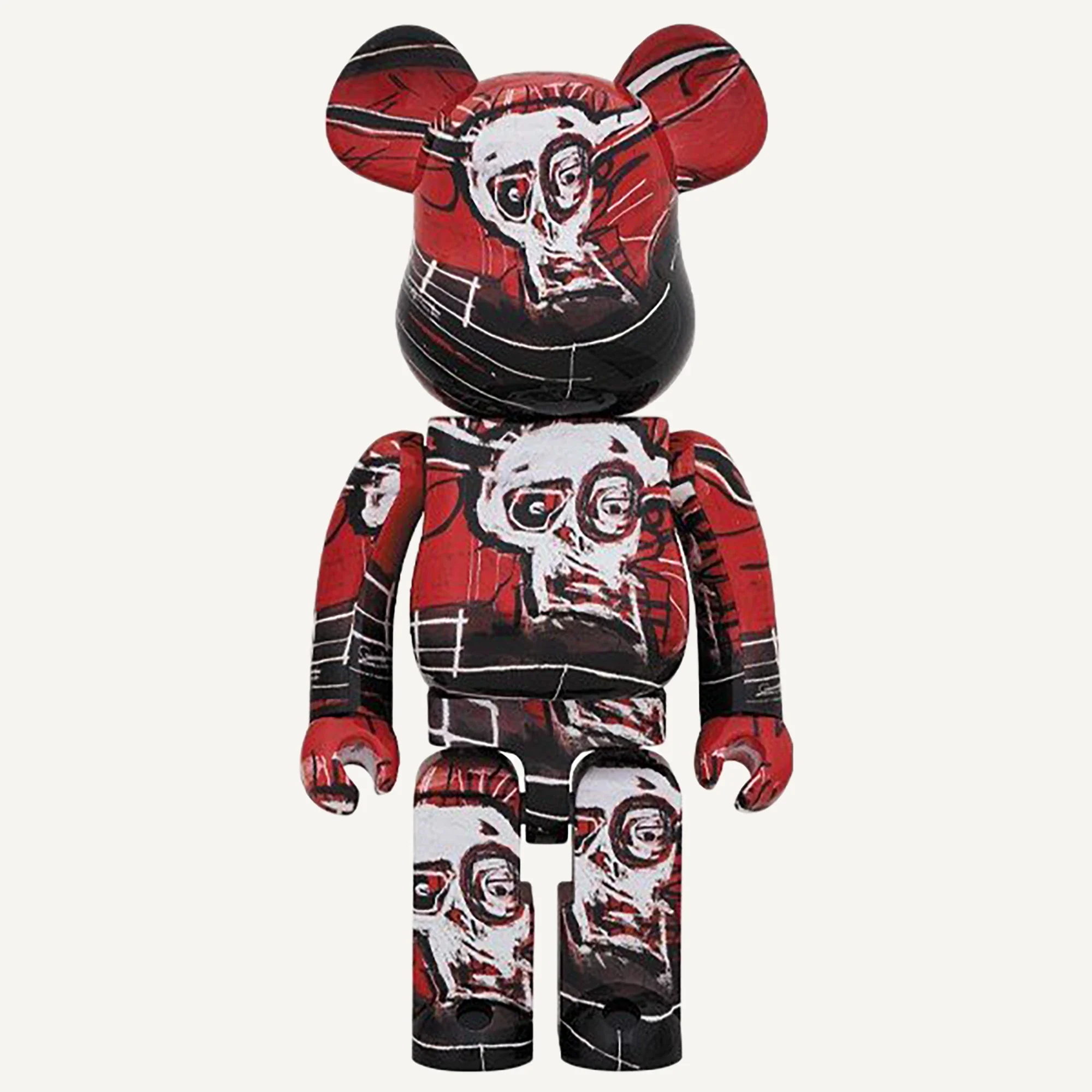
Repeated pale faces stand out against red and black areas, giving #5 a stronger contrast than blue #4. Fine lines cross the colour fields without establishing a precise painting attribution.
Archived formats: 100% + 400% (announced schedule: late July 2020); 1000% (announced schedule: late July 2020).
BE@RBRICK JEAN-MICHEL BASQUIAT #6
The sixth numbered design is documented as a 100% and 400% set and a 1000% figure, with an October 2020 planned release. It should remain distinct from SPECIAL.
Archived formats: 100% + 400% (announced store release: 17 October 2020); 1000% (announced store release: 17 October 2020).
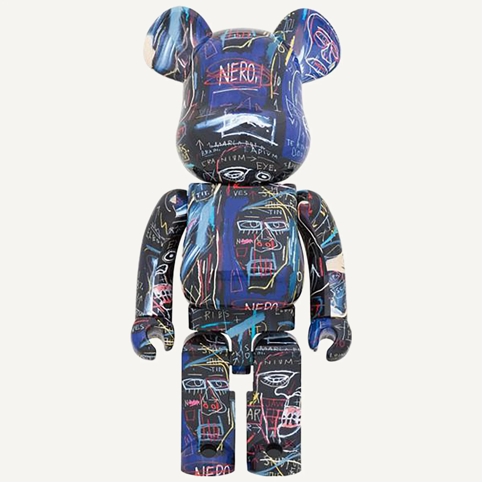
BE@RBRICK JEAN-MICHEL BASQUIAT #7
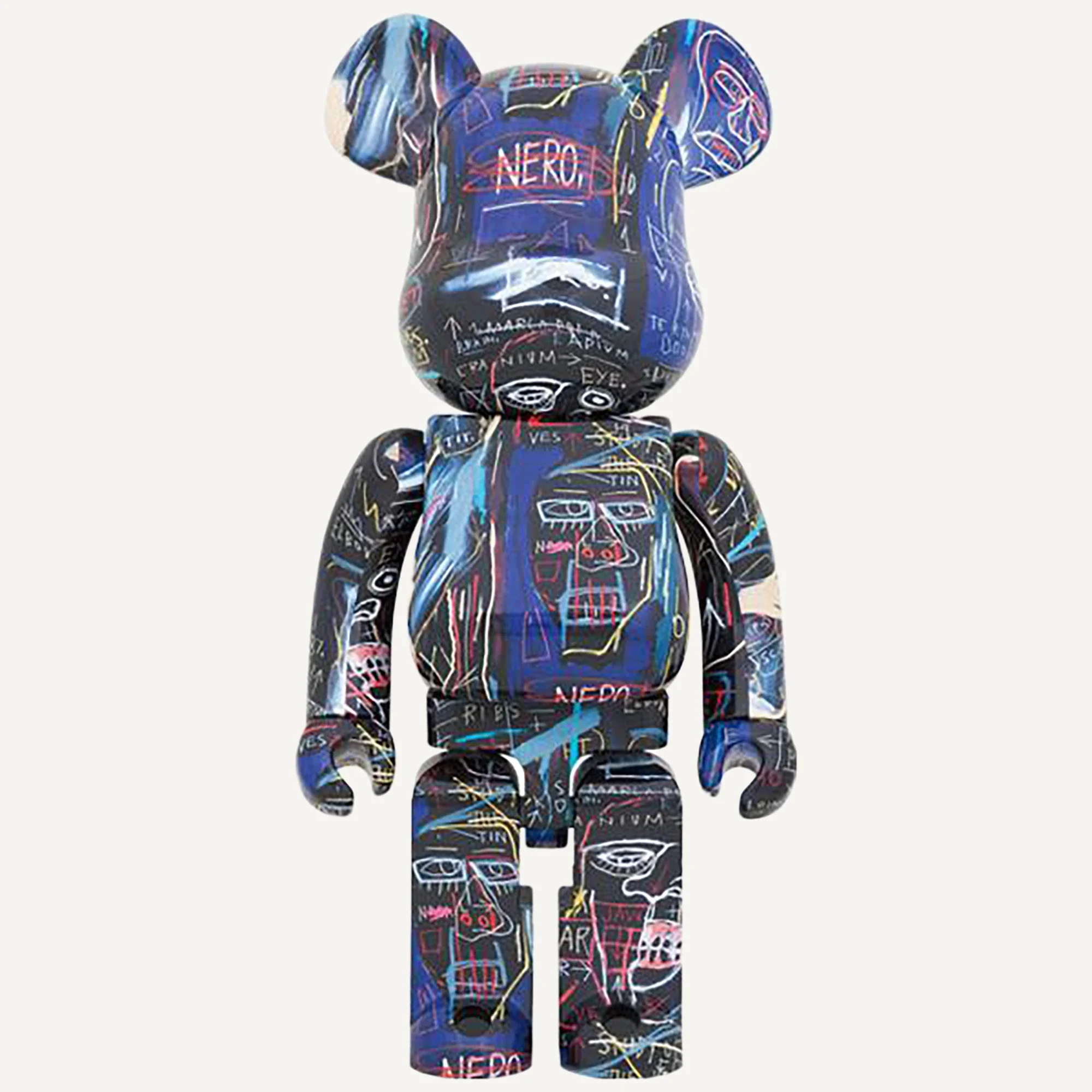
Coloured lines, words and faces form a dense network across a dark blue surface. The restless pattern differs from the more orderly repetition of crowns used in #8.
Archived formats: 1000% (announced store release: 17 April 2021); 100% + 400% (announced store release: 17 April 2021).
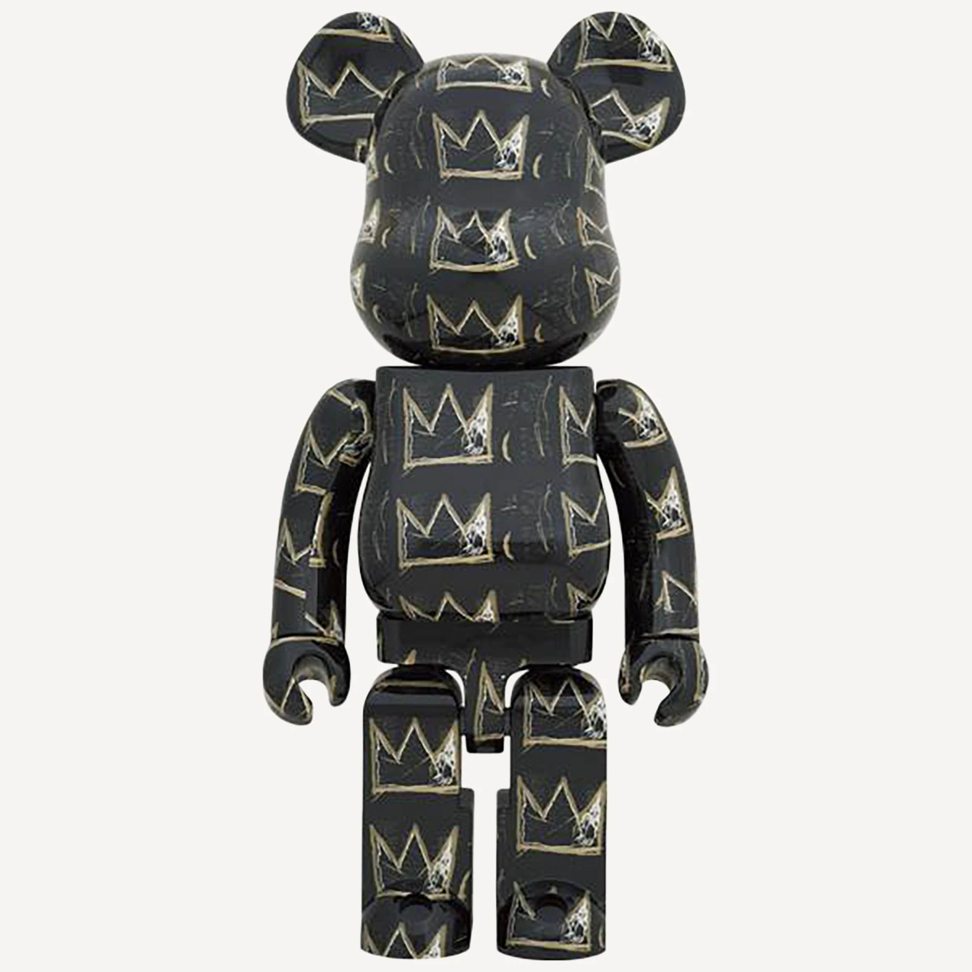
BE@RBRICK JEAN-MICHEL BASQUIAT #8
Pale outlines of three-pointed crowns repeat across a dark body. Rather than large heads or dense writing, this design relies on a recognisable motif and its repeated rhythm.
Archived formats: 1000% (announced store release: 17 July 2021); 100% + 400% (announced store release: 17 July 2021).
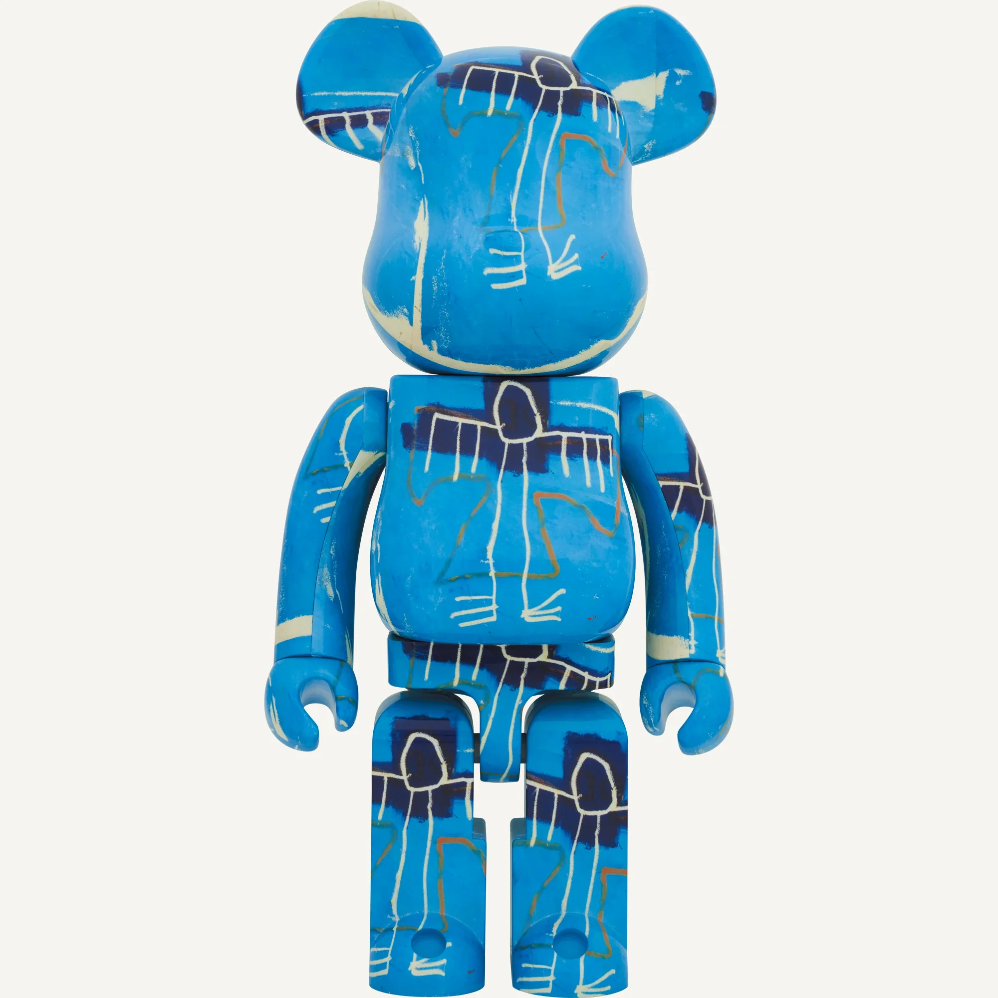
BE@RBRICK JEAN-MICHEL BASQUIAT #9
Light outlines of an elongated figure cross a bright blue surface with dark bands. The image repeats across the body; the version number does not indicate an edition of nine.
Archived formats: 1000%; 100% + 400%.
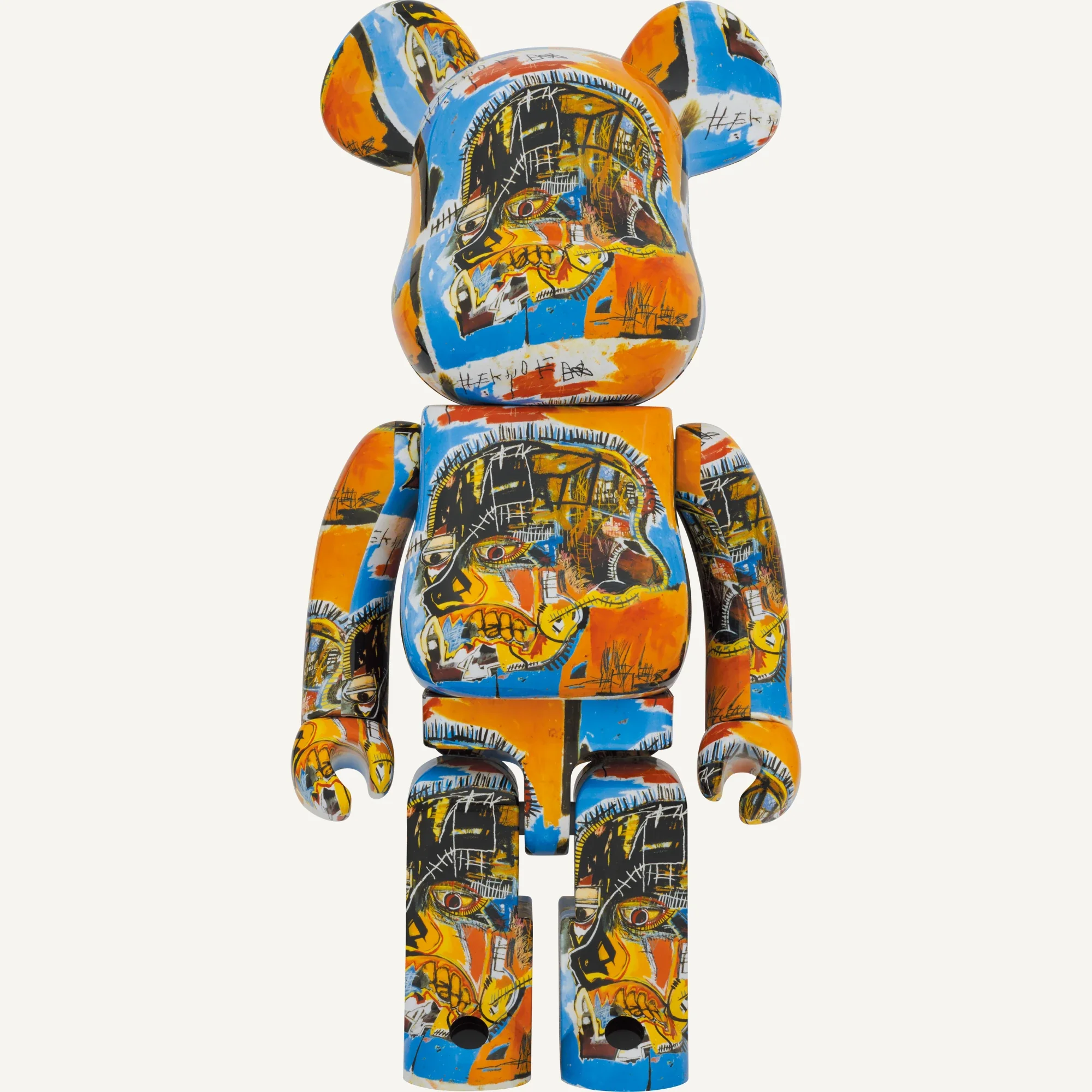
BE@RBRICK JEAN-MICHEL BASQUIAT #10
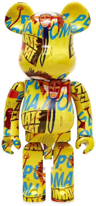
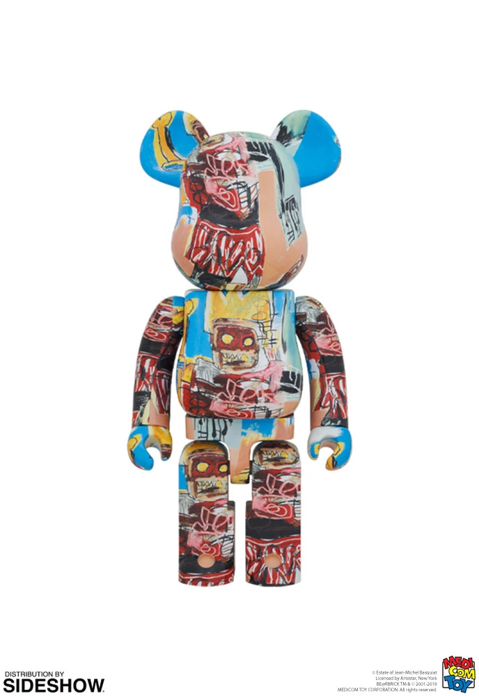
Yellow, orange and blue areas surround a large head image. Compared with the simpler blue #9, this version places greater emphasis on the face and contrasting colour fields.
Archived formats: 1000%; 100% + 400%.
BE@RBRICK JEAN-MICHEL BASQUIAT #11
Yellow and pale faces appear among red-orange strokes and white lines on a dark ground. The verified archive documents the 100% and 400% set; a 1000% version remains unconfirmed here.
Archived formats: 100% + 400% (announced store release: 20 January 2024).
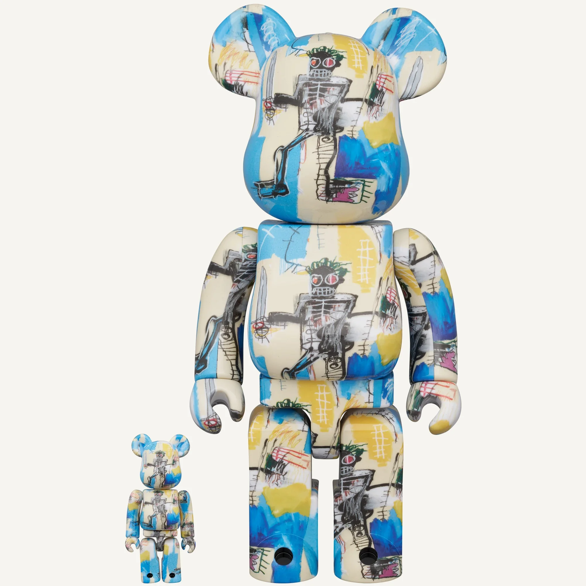
BE@RBRICK JEAN-MICHEL BASQUIAT 12th Ver.
A dark human figure with red eyes appears against cream, blue and yellow areas. This differs from dark #11; the verified announcement identifies a 100% and 400% set.
Archived formats: 100% + 400% (announced schedule: late June 2026).
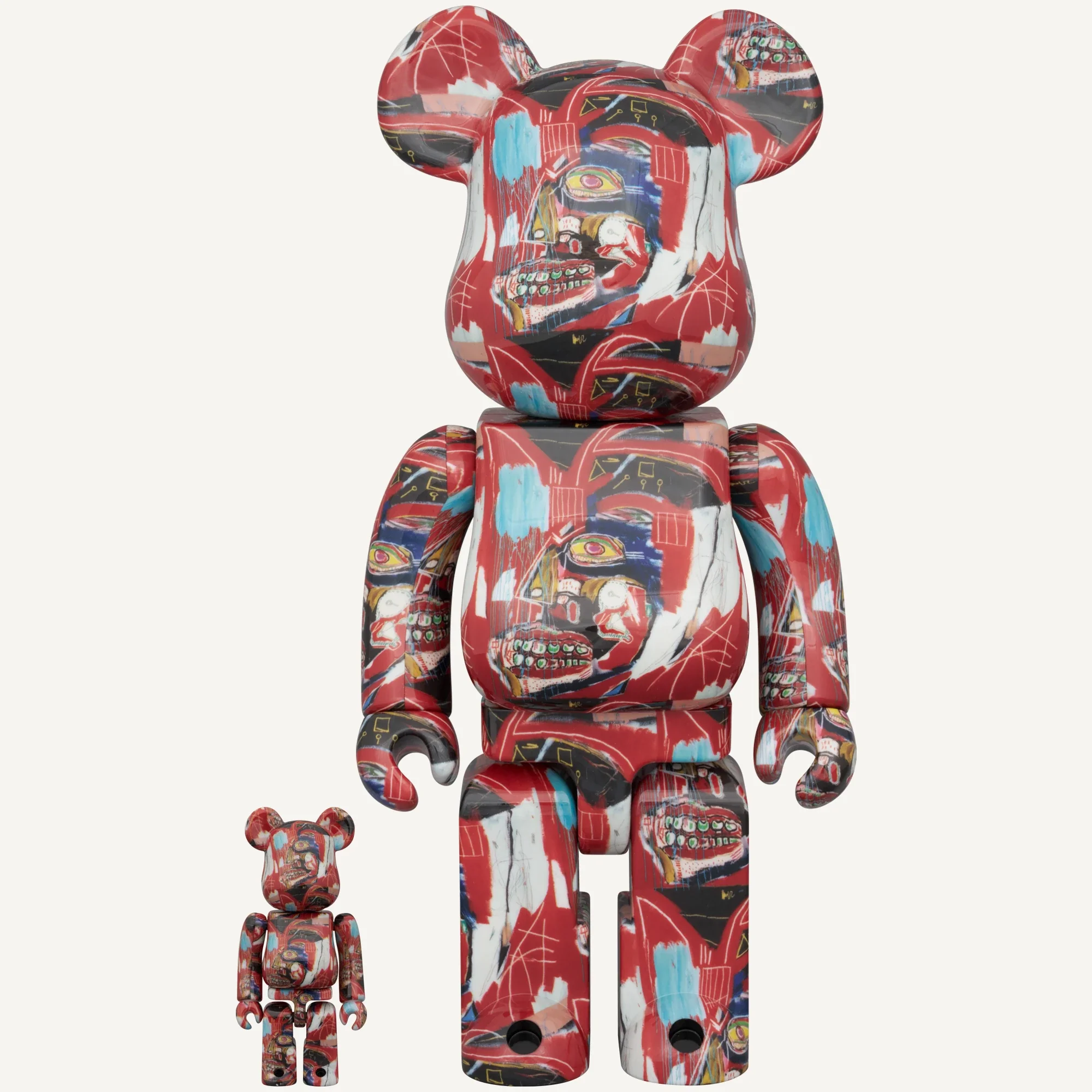
BE@RBRICK JEAN-MICHEL BASQUIAT 13th Ver.
A repeated head image stands out against red, blue and white areas. The 100% and 400% set was announced for September 2026 shipment; the announcement alone does not verify delivery.
Archived formats: 100% + 400% (announced schedule: September 2026).
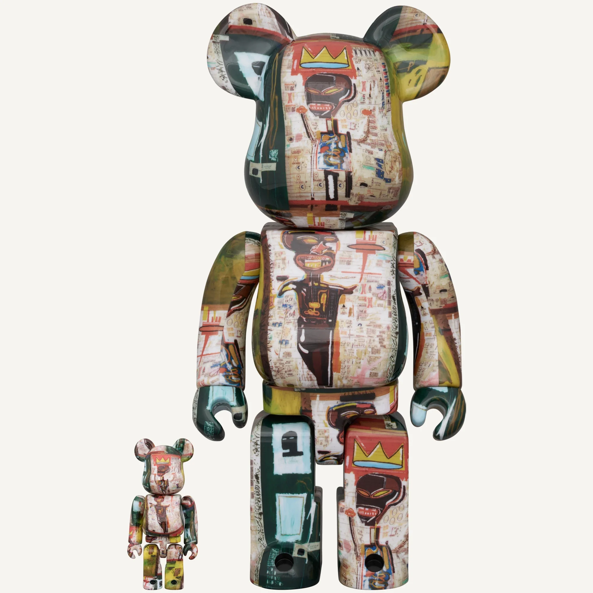
BE@RBRICK JEAN-MICHEL BASQUIAT 14th Ver.
The fourteenth announcement shows a pale collage, dark figure and yellow crown. Its 100% and 400% set is scheduled for March 2027, so it remains a future release at the review date.
Archived formats: 100% + 400% (announced schedule: March 2027).
SPECIAL, King Pleasure and the metal edition
BE@RBRICK JEAN-MICHEL BASQUIAT "SPECIAL"
SPECIAL combines contrasting colour areas, faces and graphic fragments on one bear. It is a named release outside the numbered sequence and should be compared with photographs of that specific design.
Archived formats: 100% + 400%; 1000%.
BE@RBRICK Jean-Michel Basquiat "King Pleasure"
King Pleasure is documented as a separate named release in more than one size. It should not automatically become another numbered version or establish a specific source painting by name alone.
Archived formats: 1000%; 100% + 400%.
超合金 BE@RBRICK JEAN-MICHEL BASQUIAT
Chogokin differs primarily in construction: the manufacturer specifies die-cast body components and a height of about 145 mm. It is a separate format, rather than a smaller plastic 100% and 400% set.
Archived formats: 超合金 BE@RBRICK JEAN-MICHEL BASQUIAT.
The Warhol × Basquiat joint editions
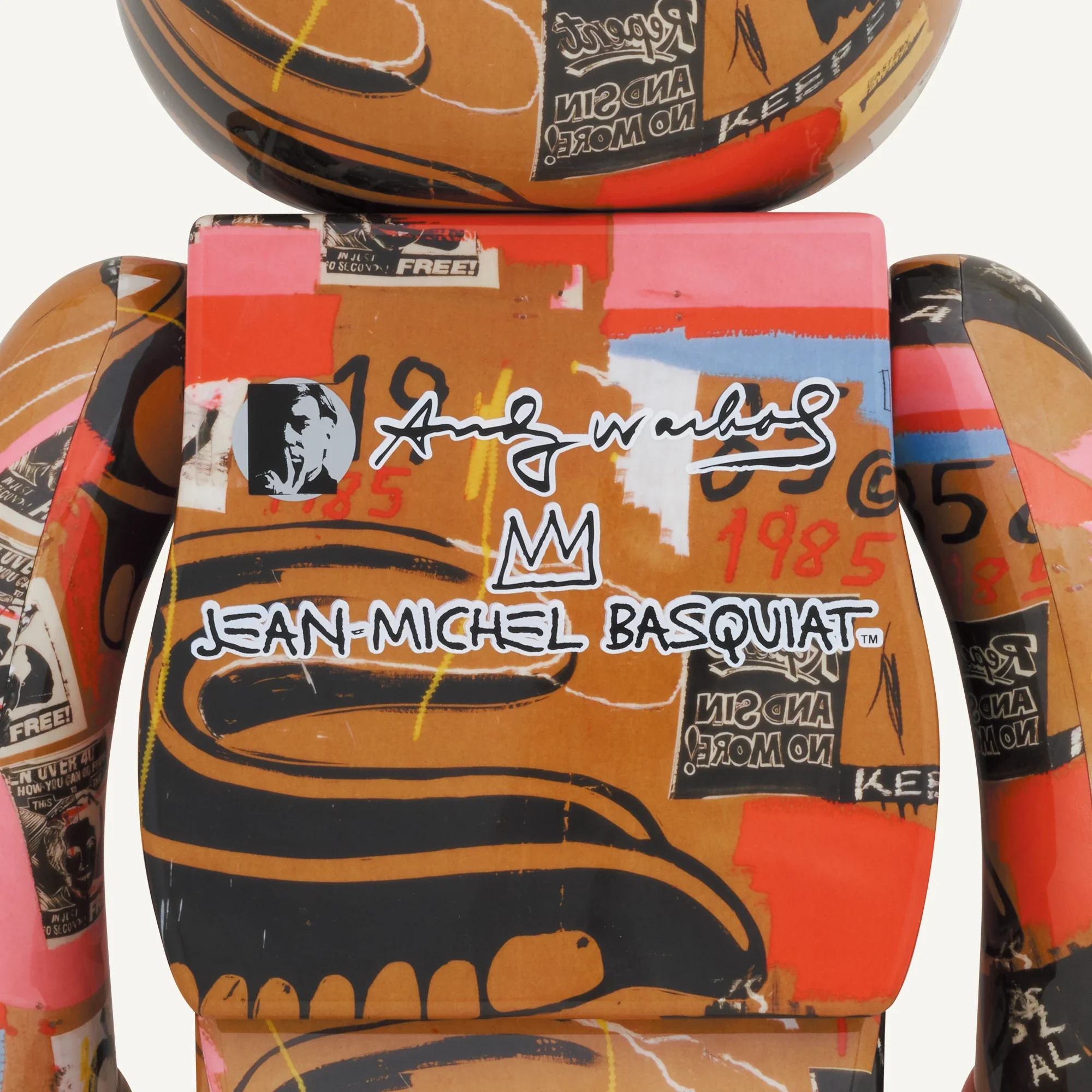
BE@RBRICK Andy Warhol × JEAN-MICHEL BASQUIAT #1
Warhol × Basquiat #1 identifies a distinct design in the joint licensed line. The number describes the version, not its edition size; name a precise painting only when the source supports it.
Archived formats: 1000%; 100% + 400%.
BE@RBRICK Andy Warhol × JEAN-MICHEL BASQUIAT #2
Warhol × Basquiat #2 identifies a distinct design in the joint licensed line. The number describes the version, not its edition size; name a precise painting only when the source supports it.
Archived formats: 1000%; 100% + 400%.
BE@RBRICK Andy Warhol × JEAN-MICHEL BASQUIAT #3
Warhol × Basquiat #3 identifies a distinct design in the joint licensed line. The number describes the version, not its edition size; name a precise painting only when the source supports it.
Archived formats: 1000%; 100% + 400%.
BE@RBRICK Andy Warhol × JEAN-MICHEL BASQUIAT #4
Warhol × Basquiat #4 identifies a distinct design in the joint licensed line. The number describes the version, not its edition size; name a precise painting only when the source supports it.
Archived formats: 400%; 1000%.
Superalloy BE@RBRICK Andy Warhol × Jean-Michel Basquiat
The joint Warhol × Basquiat Superalloy is a separate metal-format release. Check its own dimensions and construction rather than borrowing specifications from plastic sets or the numbered design line.
Archived formats: Superalloy BE@RBRICK Andy Warhol × Jean-Michel Basquiat.
A source artwork and a fragment are not the same description
A product page may name Basquiat without identifying a particular painting. In that situation, matching a familiar-looking face to a famous canvas is not enough to establish the source. Several works can share motifs, and a design may show only a cropped or rearranged part.
The official #9 listing, for example, provides the product’s identity and specifications. It does not supply a complete artwork attribution that should be expanded by guesswork.
A careful description can still be informative: identify the release, describe its visible imagery and explain how it travels around the bear. If a precise source title is confirmed, that becomes an additional layer of understanding rather than an assumption disguised as a fact.
Surface details
Warhol and Basquiat: paintings first, collectible releases later
Basquiat and Andy Warhol did work together during their lifetimes. The Fondation Louis Vuitton’s exhibition on their collaboration describes around 160 paintings made together in 1984–1985. Their exchange brought recognisable imagery, drawing and painterly interventions into shared compositions.
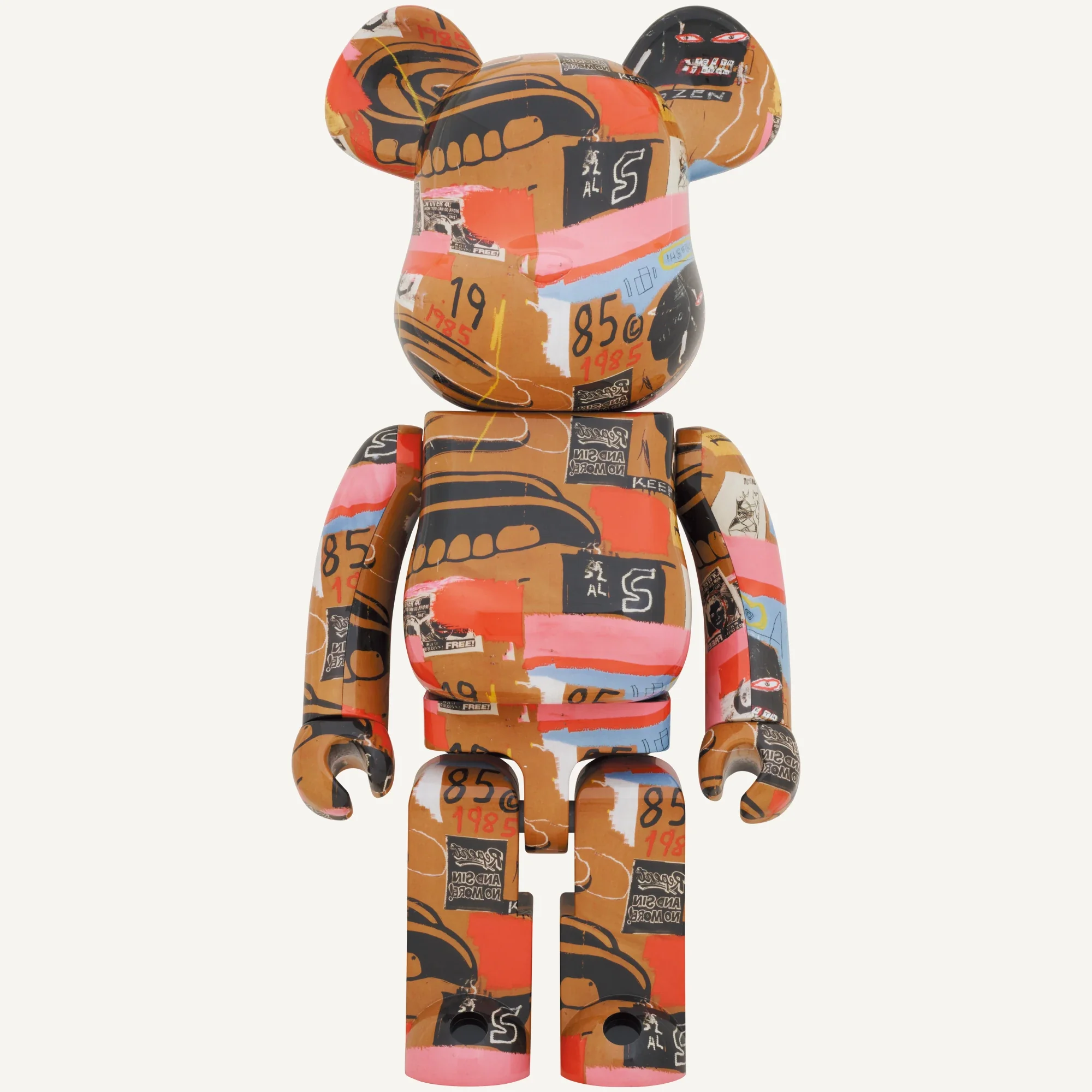
Modern Warhol/Basquiat BE@RBRICK releases belong to a different stage of that history: licensed adaptations for the bear platform. The existence of the historical paintings does not mean either artist personally designed these later figures.
Our Andy Warhol BE@RBRICK article covers the neighbouring Warhol line. It is useful to keep both contexts visible: a real artistic collaboration in the 1980s and the later products that draw on its legacy.
Warhol × Basquiat #2
How size changes the way the design reads
With a detailed surface, scale changes what you notice first. A 100% figure can be a small graphic accent; a 400% version invites closer inspection on a shelf; a 1000% object has a stronger relationship with furniture and the room around it.
For the documented #9 100% and 400% set, the two formats belong to the same named release. That does not make their visual effect identical: a small line or word occupies a different place in your field of view.
Our BE@RBRICK size guide explains the format differences. Decide where the figure will stand before choosing by size alone.
Give the surface room to be seen
A visually busy object does not necessarily need an equally busy setting. A plain wall, quiet shelf or restrained display can make its marks and colour more legible. This is a practical way to present the design, not a claim about a particular collector’s home.
Leave space to see the silhouette and, if possible, the sides. A tightly packed row can conceal the very fragments that make one version different from another. Looking at the rear photograph is especially useful when the figure will stand away from a wall.
Lighting also matters. Strong reflections may hide a word or drawing in one view. Softer light and several angles help explain the surface without making a single photograph carry the whole story.
Choosing a version for your collection
Choose the design you want to keep looking at, then check the complete release name, size, condition and packaging. Compare the same version with reliable photographs. One artist name or a similar palette cannot identify the whole product.
You can explore the BE@RBRICK 400% collection and 1000% collection for specific objects. These catalogue links do not imply that every historical Basquiat version is available.
The guide to original and counterfeit BE@RBRICK covers authentication separately. Here the starting point is simpler: understand which visual composition you are choosing and how you would like to live with it. A meaningful collection need not include every numbered release.