In this article
A collaboration with its own history
BE@RBRICK × KAWS is easy to recognise by its crossed-out eyes, but recognition alone does not identify a particular release. The collaboration brings together two systems: MEDICOM TOY’s bear-shaped platform and an artist whose images move between figures, prints and paintings. Its appeal lies in watching those systems meet. The familiar body remains, while its visual role changes. At one moment it carries a character; at another, it becomes a surface for anatomy or colour.
COMPANION and BE@RBRICK are not interchangeable names. COMPANION has its own body and many different poses; BE@RBRICK retains the construction of a bear. KAWS can connect both objects within a collection without making them the same model. For an introduction to the wider cast, see our guide to KAWS characters. Here, the focus is narrower: how the artist approached the BE@RBRICK form across several distinct periods.
2002: early KAWS and SERIES 4
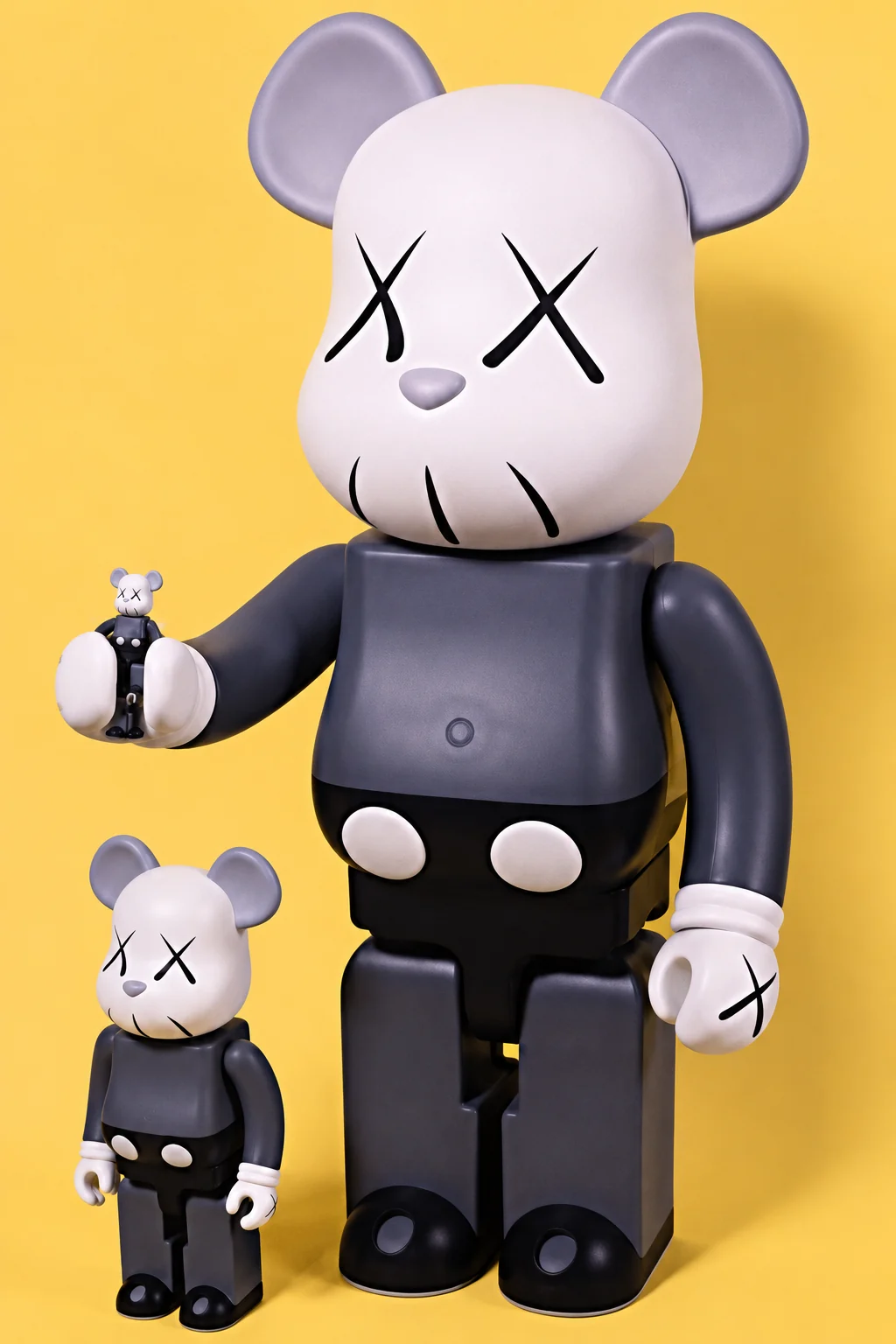
The MEDICOM TOY archive confirms KAWS in SERIES 4, in the small format measuring approximately 7 cm. A separate archive entry for the early larger figures describes 400% and 1000% and explicitly states that a 100% figure is not included. A photograph of several sizes together therefore does not establish that they were originally sold as one set.
The early designs reward a slower look. Follow the outline of the head, notice the eyes, then move towards the body. There is less competing visual information than in later, brighter examples, which makes the transfer of character onto the bear particularly clear. Within a collection, an early figure can act as a reference point: place a later design nearby and it becomes easier to see what has changed.
The percentages indicate scale, not degrees of rarity or quality. Before choosing, translate them into actual measurements and compare those with the depth of your shelf. Our BE@RBRICK size guide, available in Ukrainian, offers a fuller comparison.
CHOMPERS predates OriginalFake
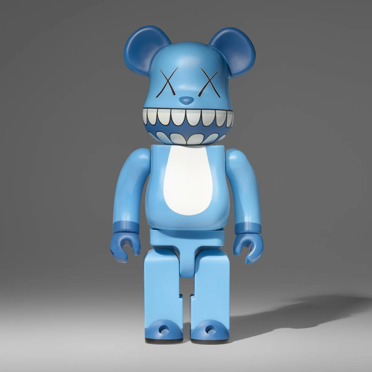
The tooth-like graphic provides another thread through the collaboration. The official archive records a-nation × KAWS CHOMPERS 100% & 400%, with applications accepted between 23 June and 7 July 2003. That date matters because it prevents every similar dental pattern from being folded into a single later OriginalFake release.
When comparing photographs, look at where the band of teeth sits, how it crosses the stomach and whether it continues around the back. A related motif can produce a different rhythm depending on the background colour and the size of the figure. A frontal photograph establishes the composition, while a three-quarter view shows how the graphic wraps around its volume. Both are more useful than an isolated close-up of a logo.
Sellers sometimes use Chomper or Chompers as convenient shorthand. A full release name is more helpful when researching a particular object. Without it, figures from different dates and materials can end up beside one another as though colour were their only difference. Start with the specific model, then use the shared motif to explore its relationships.
What OriginalFake actually means
The word Fake can be misleading out of context. OriginalFake is the proper name of the KAWS and MEDICOM TOY project. It is not a warning that a figure is a replica. The National Gallery of Victoria dates the Tokyo store and label to 2006–2013, providing useful context for a name that appears across different kinds of objects.
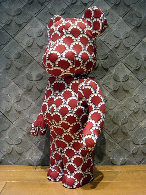
Surface becomes particularly interesting in this part of the story. A graphic can read like a clothing print, while a large bear provides room for it to unfold. Compare two scales from the same viewing distance: one may read first as a complete silhouette, while the other draws attention to individual fragments of pattern. The difference affects how the object relates to neighbouring things, not simply how much shelf space it needs.
It helps to separate two questions: what image is being used, and what the object is made from. On a screen, matt paint, fabric and wood can look surprisingly close. In a room, they catch light differently. A side view and a close photograph of the surface can reveal details that disappear under flat frontal lighting.
The collaboration continued beyond the label’s first year. MEDICOM TOY’s sixth-anniversary announcement names a WORLD WIDE TOUR BE@RBRICK 1000% OriginalFake launching on 3 May 2012. It is a separate chapter between the early works and TENSION. Keeping full captions for individual models makes that development easier to follow than grouping every OriginalFake figure beneath one date.
For a collector, the full name is more useful than the shorthand “OriginalFake bear”: it preserves a connection to a particular idea, date and format.
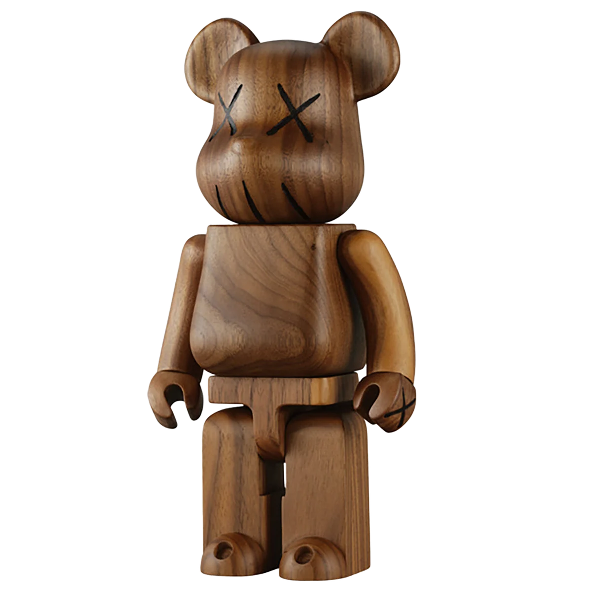
The wooden WORLD WIDE TOUR figure
The WORLD WIDE TOUR KAWS 400% archive confirms KARIMOKU’s real-wood construction, a 2005 copyright and January 2006 shipping.
Wood changes how the object invites attention. With a strongly printed figure, the image tends to lead; here, grain and natural tone become part of the experience. Beside bright or glossy examples, a wooden figure can introduce a quieter interval. That is an editorial observation about arranging objects, rather than a rule that determines which interior style it belongs in.
A wooden body also does not make every KARIMOKU release equivalent. Artist, project, size and condition still matter. Keep the full name in your own records rather than labelling the piece simply “wooden KAWS”. If photographs were taken under different lighting, compare shape and identifiable details before drawing conclusions from the apparent shade of the timber.
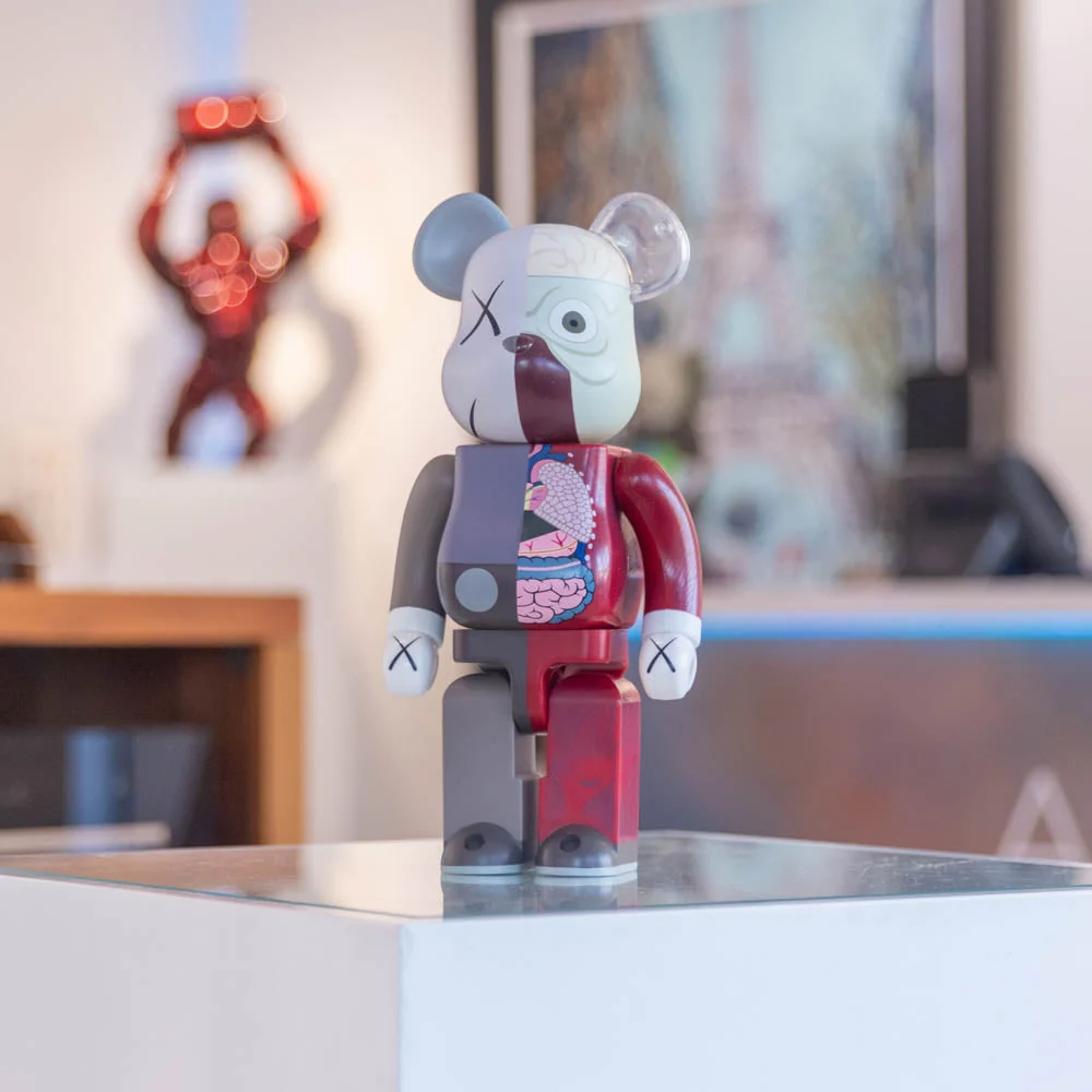
Dissected: another layer inside the bear
Dissected places an exterior beside a stylised suggestion of what lies beneath it. One part remains familiar while the other reveals a second visual layer. The effect encourages a different kind of looking: the figure becomes more than a character to recognise. A complete photograph makes this relationship much clearer than a tightly cropped face.
Dates should be checked against a specific version. Sotheby’s catalogues a black OriginalFake Dissected 400% as executed in 2008–2010. A broad auction date cannot establish that every brown, grey and black example appeared on the same day. Likewise, a Dissected COMPANION with its own body and a Dissected BE@RBRICK on the bear platform are related images, but different objects.
Hypebeast’s contemporary release report gives 28 February 2009 and three sizes: 100%, 400% and 1000%. That documents a particular Dissected release alongside the dates attached to individual colourways.
For display at home, try giving this design some breathing room. A busy book cover or small repeating pattern immediately behind it can compete with the anatomical drawing. Begin with a neutral background, add neighbouring objects gradually, then view the arrangement from across the room. The best position is the one that lets the design remain readable from where you normally see it.
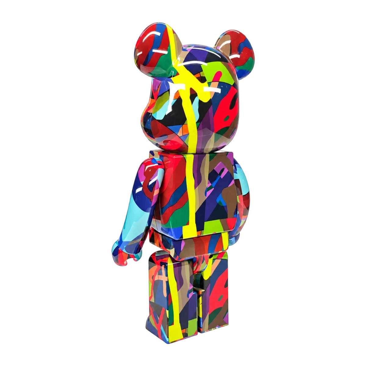
TENSION brings colour to the foreground
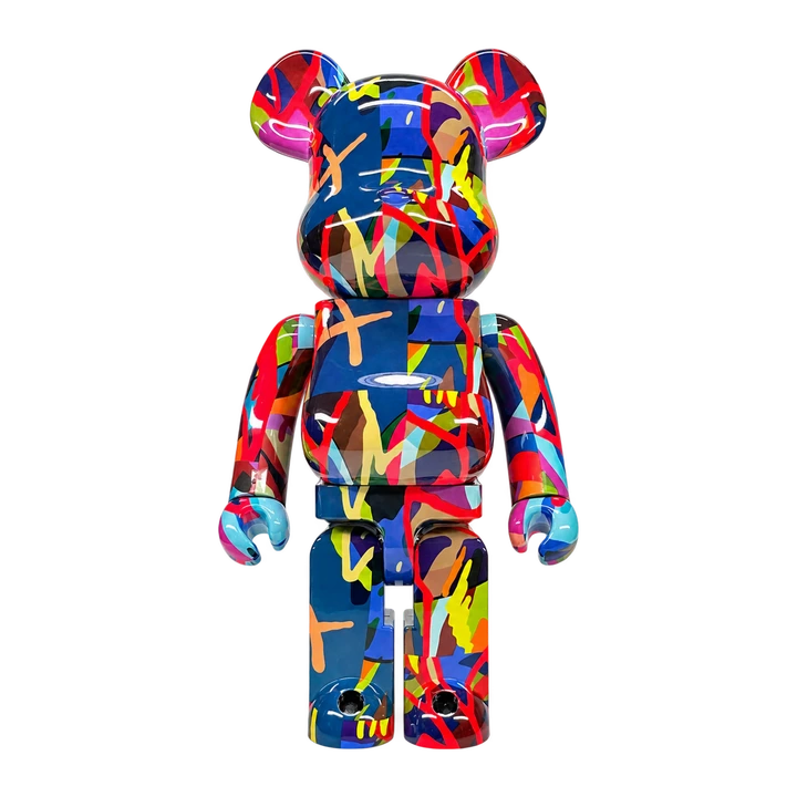
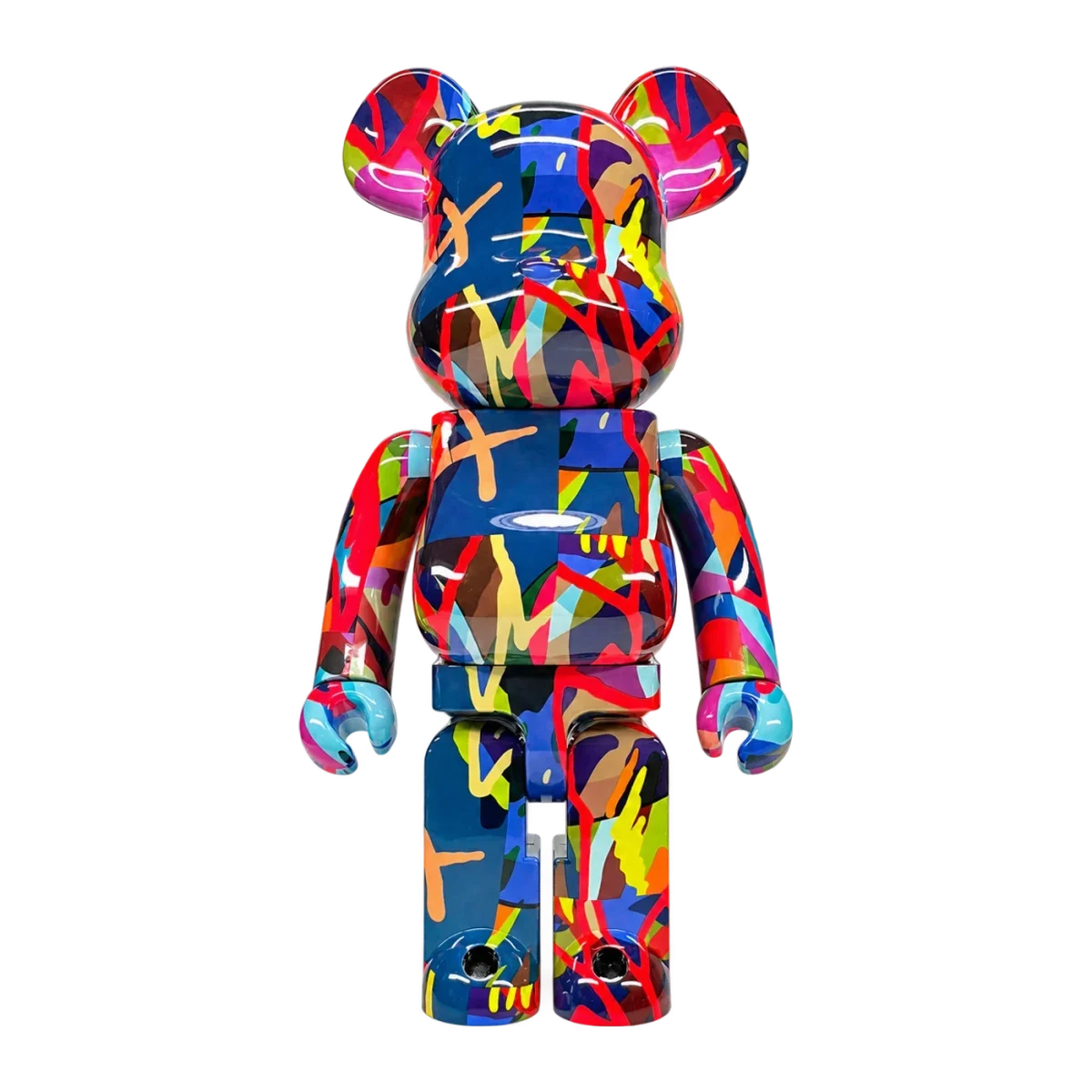
TENSION shifts attention towards saturated areas of colour and contours crossing the body. Compared with an early restrained design or the divided anatomy of Dissected, it encourages the eye to travel over the whole surface. The bear’s construction holds the composition together while the graphic seems to continue beyond the boundary of an individual arm or leg.
This is a 2021 release associated with KAWS TOKYO FIRST. MEDICOM TOY’s July announcement concerned lottery applications, while a November post announced a separate online sale. Such records explain why several dates can appear in the history of one work: they may describe different sales stages rather than different designs.
The official set listing confirms 100% and 400%, approximately 7 and 28 cm high. Compare photographs taken from similar angles to see how scale changes the impact of individual colour fragments. The miniature and the larger figure may appeal for different reasons even when they share a name. Look at the entire object rather than choosing from one particularly attractive cropped detail.
Photographs
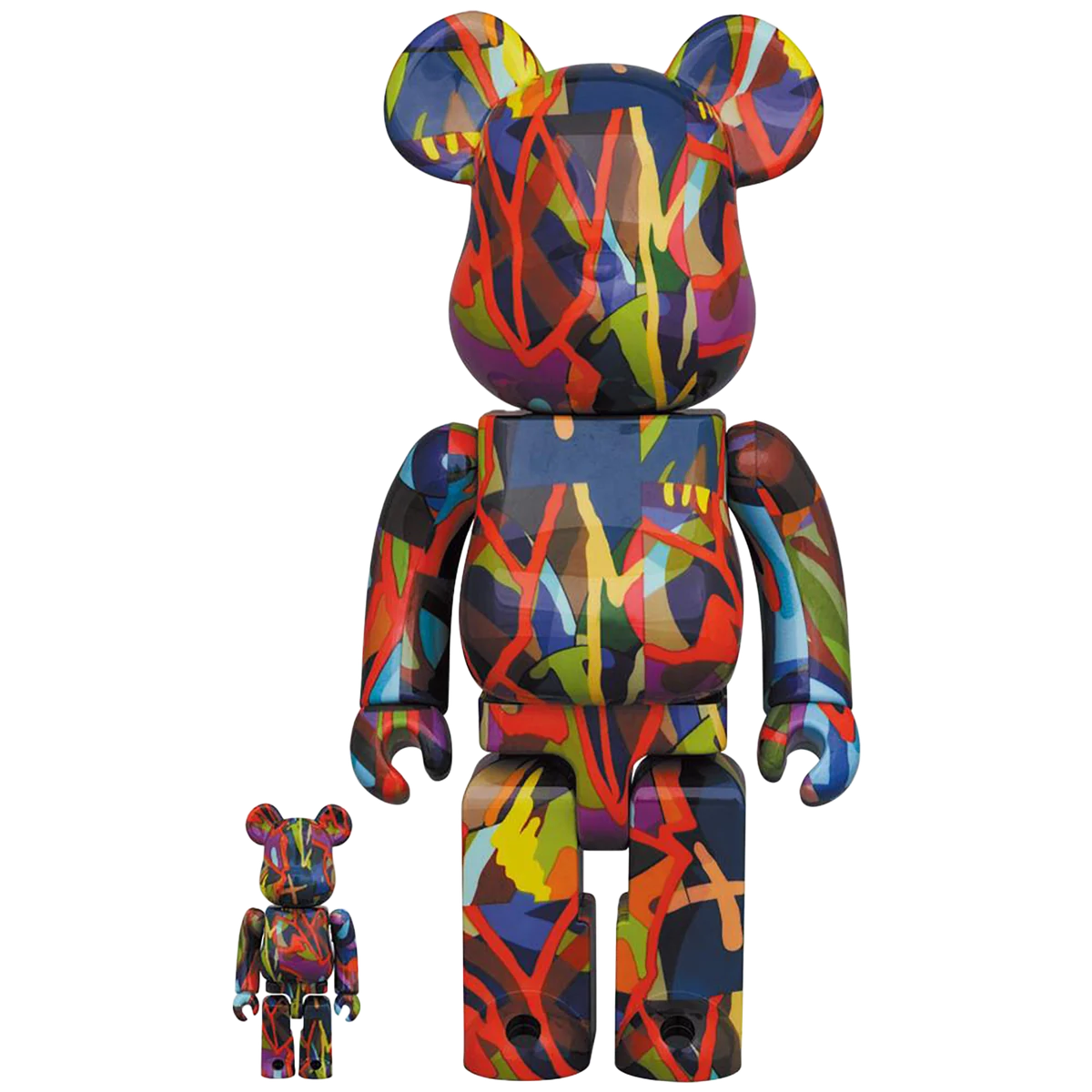
Reading photographs of a particular example
A useful sequence begins with a frontal view, then the back, a three-quarter angle and finally a surface detail. Each answers a separate question. The front explains the composition; the back completes the picture; the angled view reveals depth. Only then does a detail photograph become especially informative, showing the application of the image, the texture or the condition of a visible area.
An interior photograph serves another purpose. It helps explain a figure’s relationship to furniture and the room, but cannot replace photographs of the object itself. A small bear in the background should not be identified as a particular rare release on colour alone. A reliable caption needs sufficient image detail or confirmation from the person who photographed the space.
Nor can one photograph establish authenticity. The full model name, markings, packaging, condition and documented history belong in the same conversation. This matters particularly when several versions look close. Precise records make it easier to ask useful questions and avoid comparing quite different objects under one loose description.
Turning release history into a personal collection
Collecting KAWS BE@RBRICK does not have to mean following every year in order. One approach follows changes in the artist’s visual language: early character, CHOMPERS, anatomy, then the more abstract colour of TENSION. Another concentrates on a single scale or material. Either gives the collection an internal logic, with each addition offering a new comparison.
For a shelf, begin by considering the 400% format; for a larger standalone accent, look at the dimensions of 1000%. Our article on art toys at home explores placement in more detail.
There is no need to recreate a complete release history. Sometimes two carefully chosen figures explain an interest more clearly than a crowded cabinet: one shows a recognisable image, the other a different material or use of colour. Start with what you want to look at every day. Let the chronology help you understand that choice, rather than turn it into a checklist.