In this article
An exhibition with more than one protagonist
KAWS. Art & Comix ran at ALBERTINA MODERN in Vienna from 3 April to 27 September 2026. The exhibition has now closed. Curated by Angela Stief and Florian Waldvogel, it brought together 192 works. These are exhibition-wide figures: the show was a conversation between artists, rather than a room-by-room inventory of KAWS alone. The museum’s exhibition dossier is the starting point for this illustrated review.
For a reader who knows KAWS through collectible figures, that distinction changes the story. A familiar face can bring someone into an exhibition; what deserves attention afterwards is the company it keeps. A painted character and a sculpted body can share an expression while doing very different things with space. The useful question is how those differences become visible, rather than which name occupies the largest lettering on the poster.
Recognising a character is only the beginning
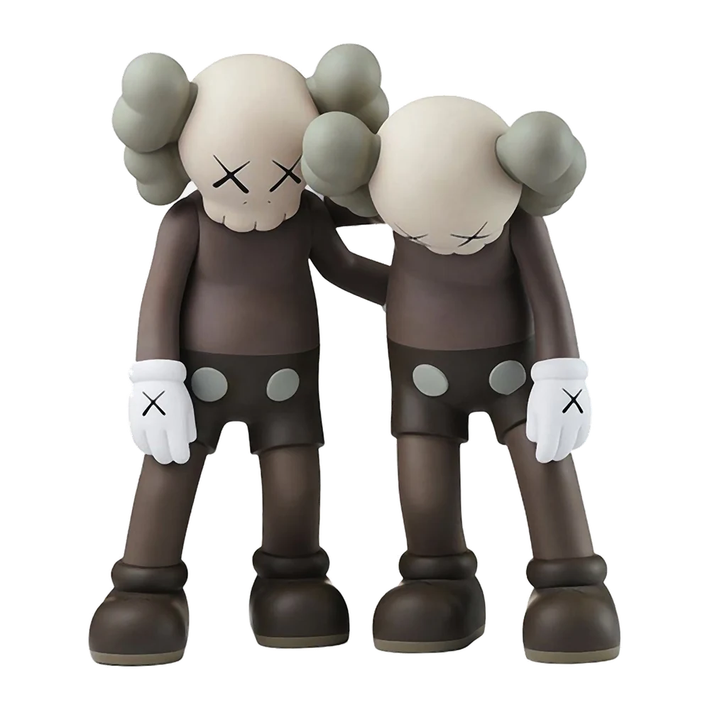
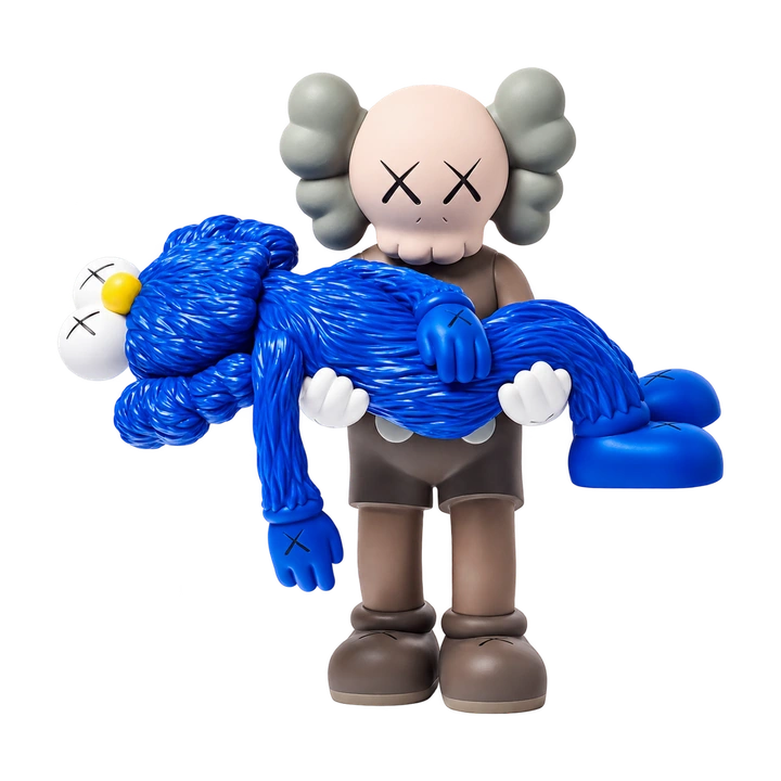
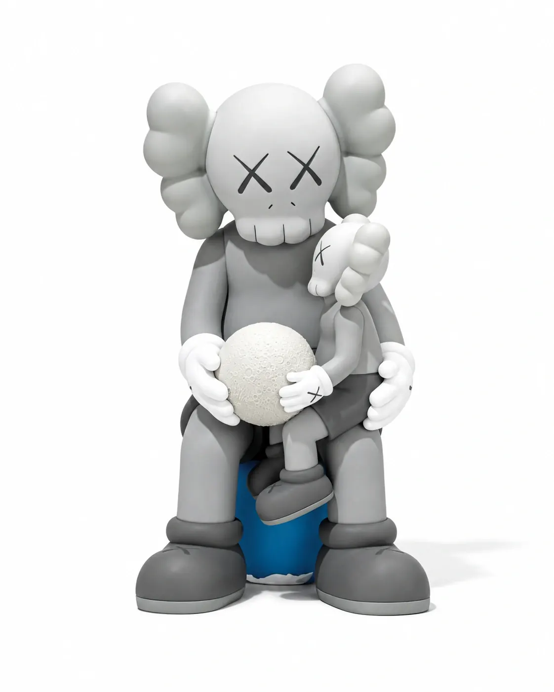
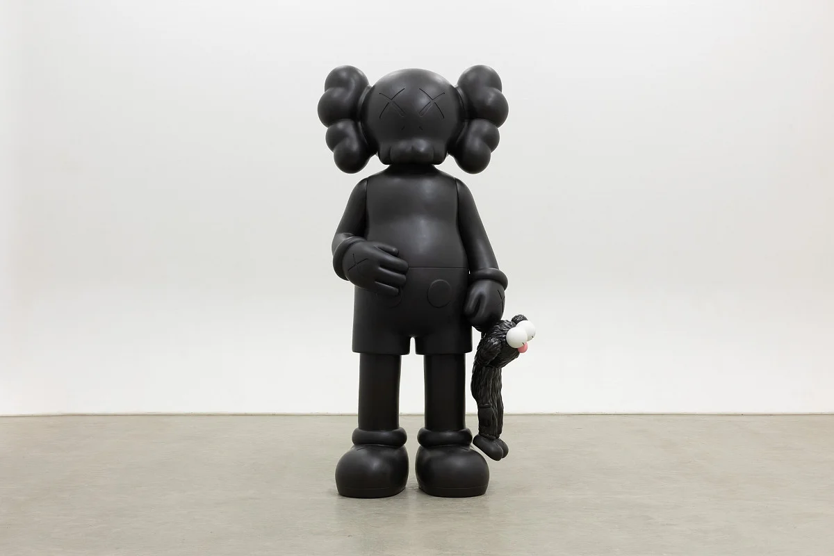
Crossed-out eyes make identification quick. They tell us who made a figure before we have properly considered what the figure is doing. It helps to reverse that order. Cover the face in a photograph and look at the head’s angle, the weight of the arms and the distance between bodies. Does the character turn towards someone, protect itself or seem unavailable? These are questions the outline can carry without a caption explaining a plot.
This is also a useful distinction between recognising a character and interpreting a work. COMPANION and BFF are not interchangeable names for every KAWS silhouette. Our guide to KAWS characters explains the differences. Here, the point is to let recognition do its first job and then move past it. The image can remain familiar while the posture makes it unexpectedly difficult to read. An expression need not have one correct emotional label.
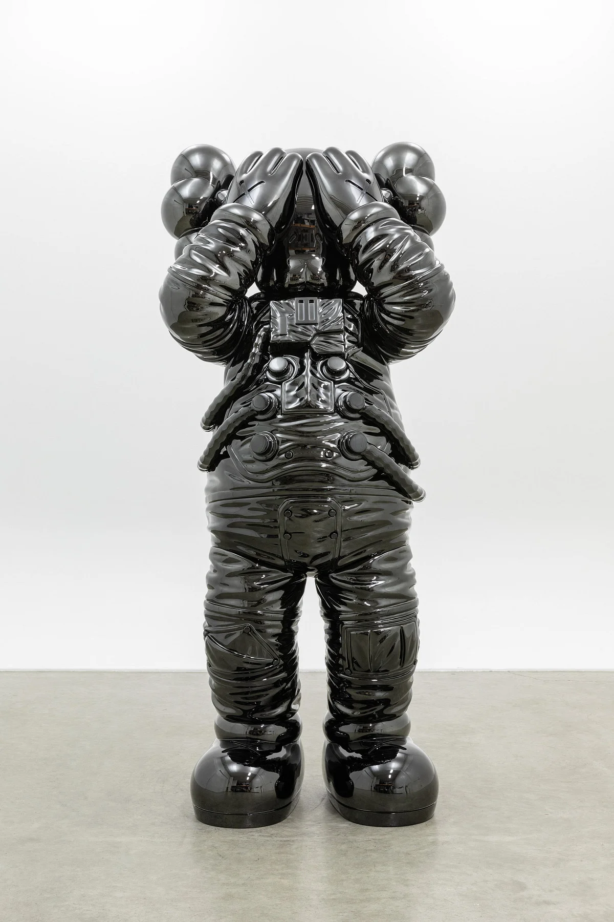
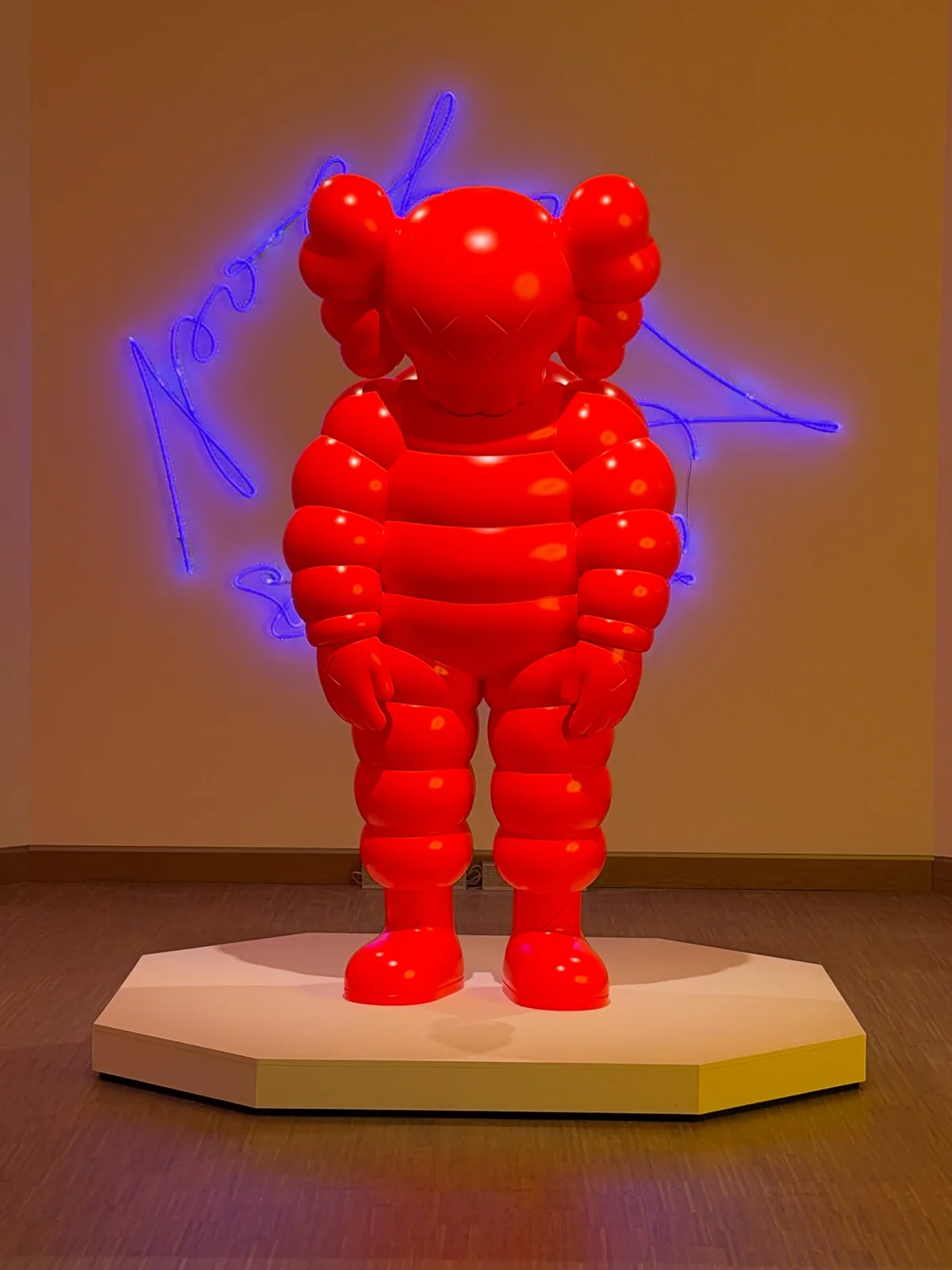
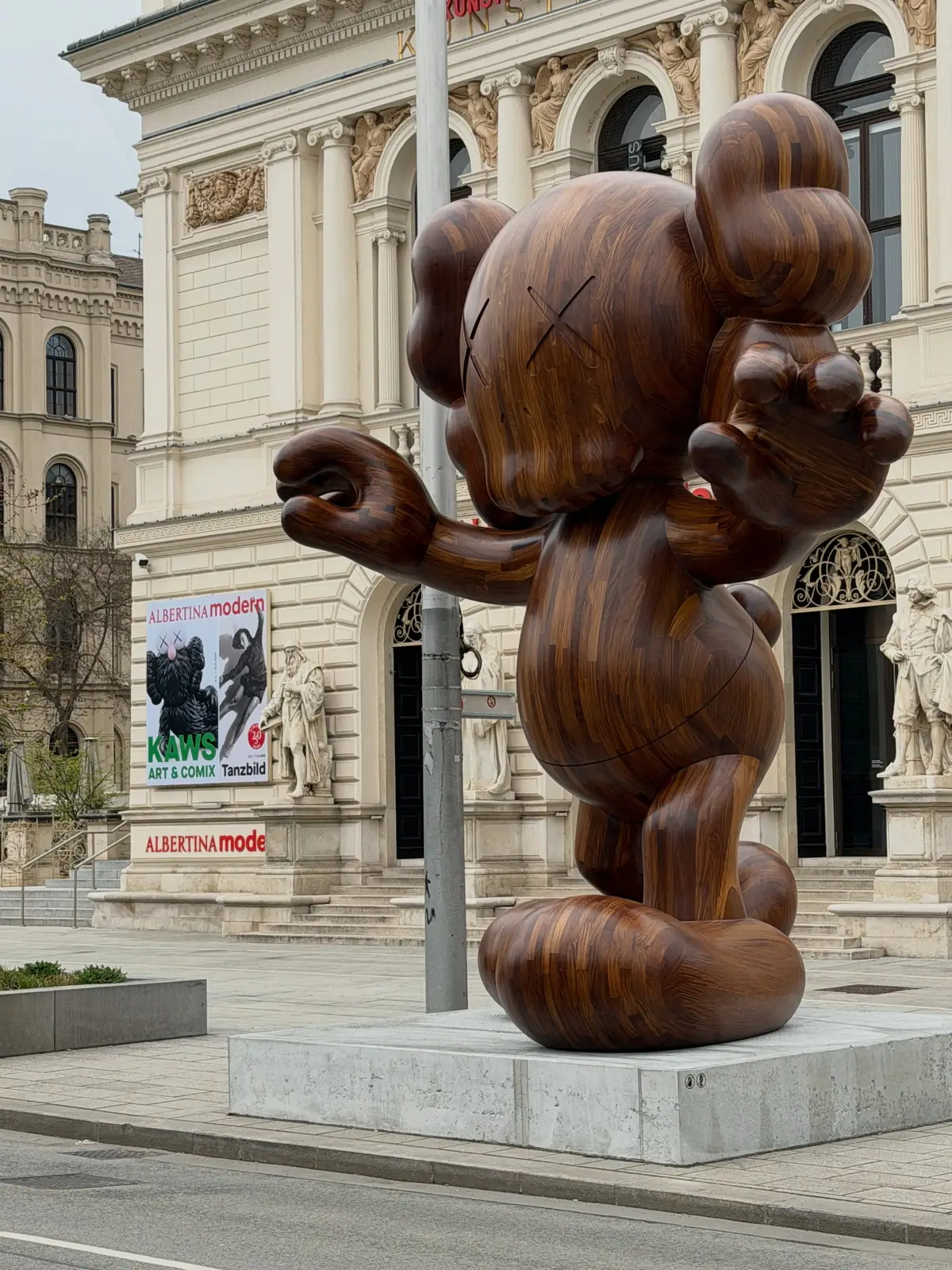
The museum captions identify SPACE as stainless steel and SHARE as painted bronze. A smooth-looking surface in a photograph does not tell us its material. Knowing that difference helps separate a character’s familiar outline from the particular object we are looking at.
Photographs
A comic image does not need a complete story
A comic strip normally has somewhere to go: a next panel, a repeated character, an action with a consequence. An isolated image removes much of that support. A raised hand can be a greeting, an interruption or a defence. Without the preceding frame, the viewer has to decide how much of a story to supply. That uncertainty is an interesting place to begin looking at the exhibition’s photographs.
The Austrian broadcaster ORF’s opening report provides a contemporary account of the show. Our reading takes a more focused route: consider how a figure asks for attention through a gesture. It is tempting to translate every lowered head into sadness. Yet tiredness, embarrassment and concentration can look remarkably similar in a simplified body. Keeping those alternatives open gives a character more room than treating it as an illustration of one feeling. It also rewards looking at several views rather than choosing the most recognisable front-facing image.
What changes when the figure has company
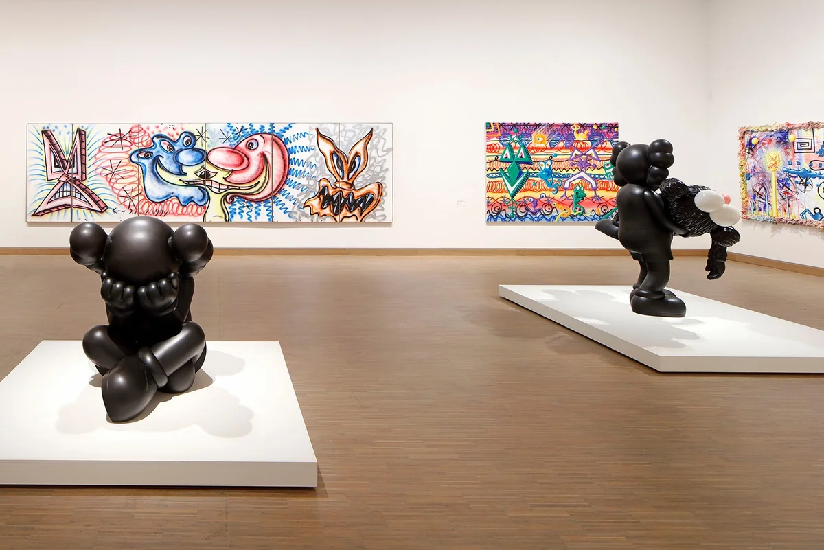
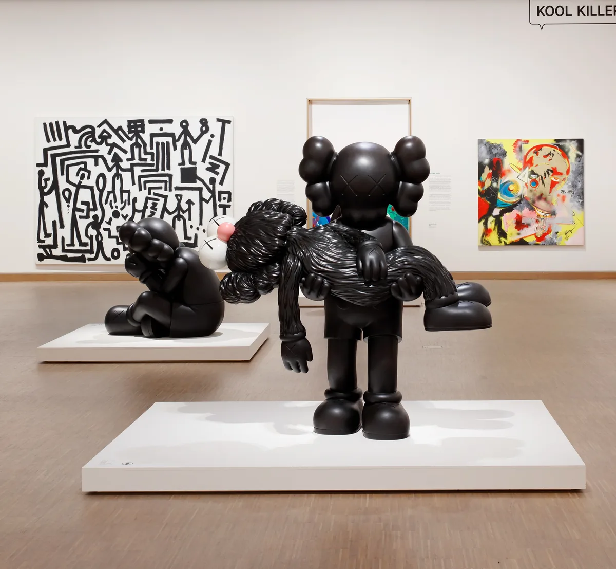
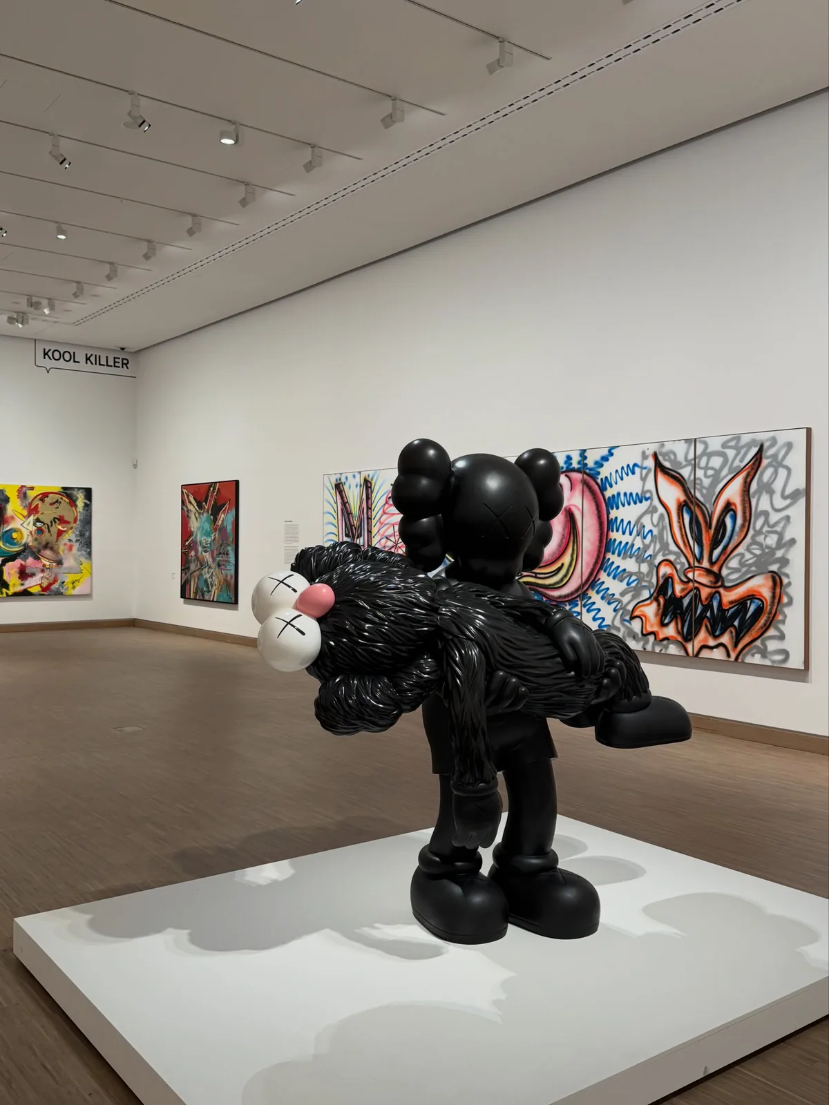
A close photograph and a wide gallery view offer different kinds of evidence. The close-up shows a seam, a contour or the relationship between a hand and a face. The room view explains how far the figure stands from another work, how much space remains around it and whether the viewer would look up or down. Neither image can replace the other. Together they prevent scale from becoming a vague claim that something was simply enormous.
The installation photograph accompanying Galerie Max Hetzler’s exhibition record is useful for precisely this reason. It documents an arrangement, not just an object. When reading a gallery photograph, start with those relationships: figure to painting, object to doorway, body to empty floor. An image on a phone makes everything equally small. Architectural edges and neighbouring works help restore a sense of proportion, even though they cannot reproduce the physical encounter.
Photographs
Let the paintings keep their own voices
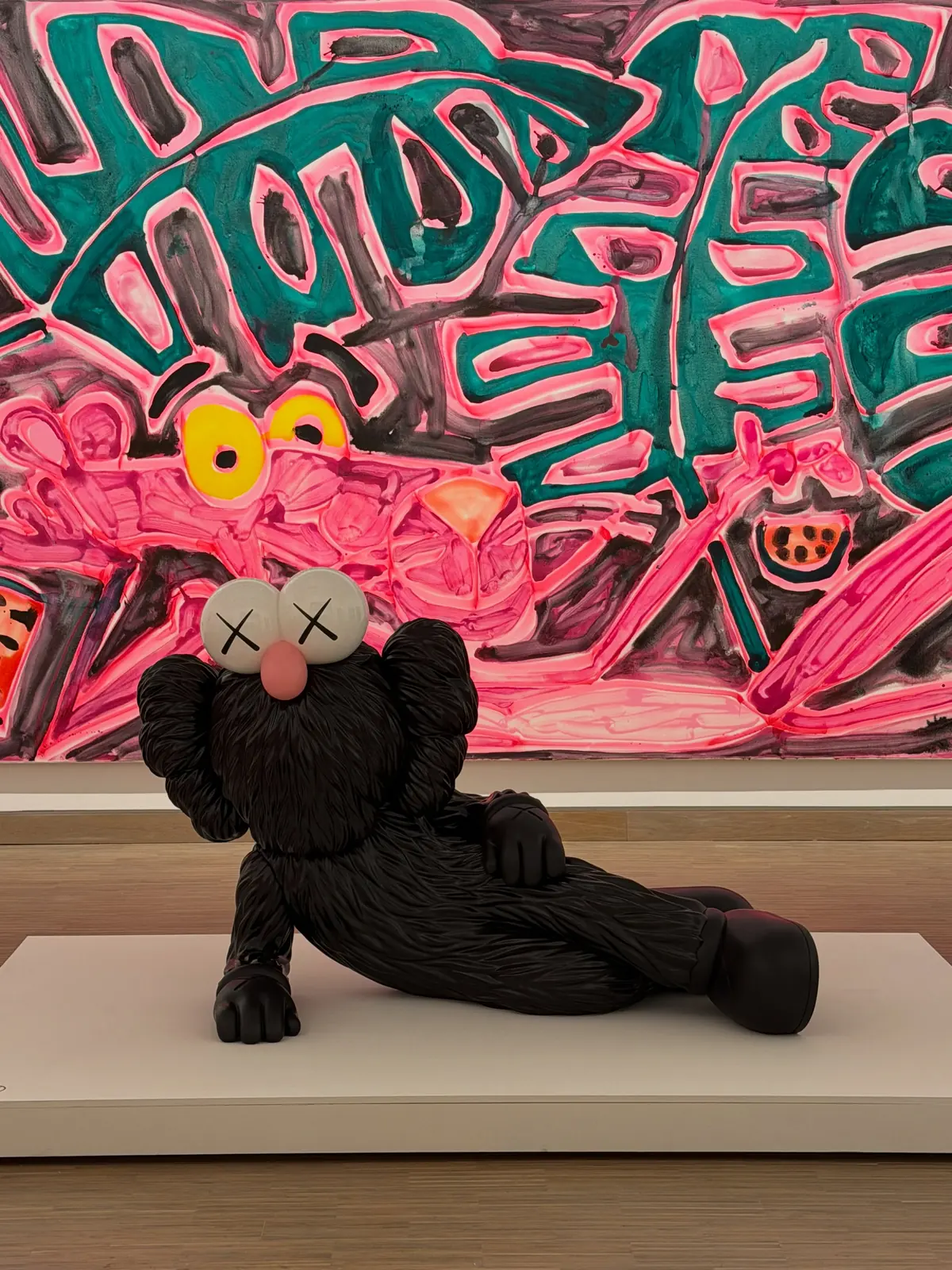
A sculpture is an easy anchor for an exhibition photograph. It has a clear outline and stands in front of the walls, so it tends to take possession of the image. The painting behind it can become a colourful setting almost by accident. A better way to look is to spend a moment with the painting alone, before returning to the entire view. Where does its movement begin? What does its colour interrupt? How does its surface ask for attention?
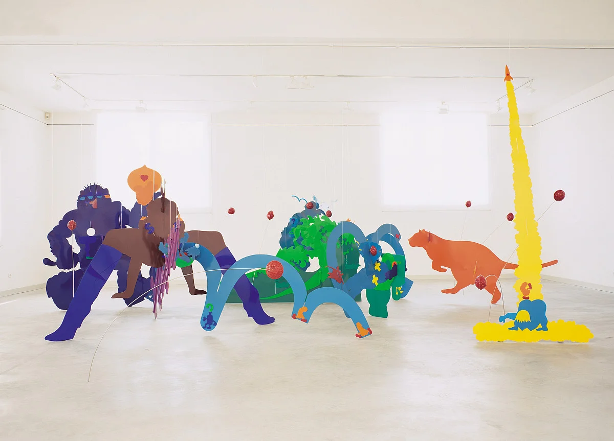
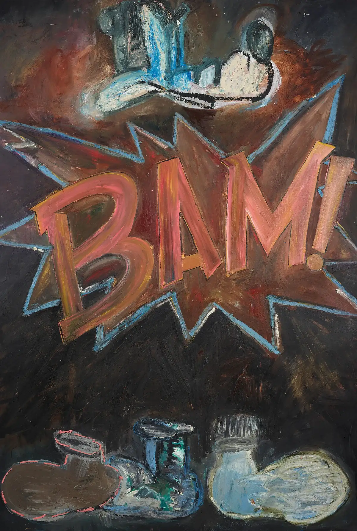
Joyce Pensato, Peter Saul and Roy Lichtenstein belong to this discussion as distinct artists, not as a supporting cast assembled to explain collectible toys. The Almine Rech exhibition record helps establish that wider context. Different treatments of a familiar image can sharpen, distort or interrupt recognition. Similar subject matter does not mean the works express the same thing. Keeping that difference in view makes the dialogue more interesting than tracing a simple line of influence from an older artist to a younger one.
TIME OFF and the problem of looking relaxed
The museum places KAWS’s TIME OFF in dialogue with Pink Panther paintings by Katherine Bernhardt and Micha Wille. That encounter is an especially useful way into the show: a reclining body can appear entirely at ease in one image and curiously exposed in another. A bent leg, an open expanse of floor or a head turned away from the viewer can change how comfortable the pose seems.
The museum dossier supplies the names and the curatorial pairing; the comparison invites a slower visual reading. Rather than deciding which work resembles the other most closely, look for what refuses to match. A painted figure remains bound to its picture’s edges. A sculpture occupies the room and can look different from each side. The shared motif gives the eye a starting point, but the change of medium keeps the encounter from collapsing into a game of spotting references.
Photographs
When a drawn world becomes a place
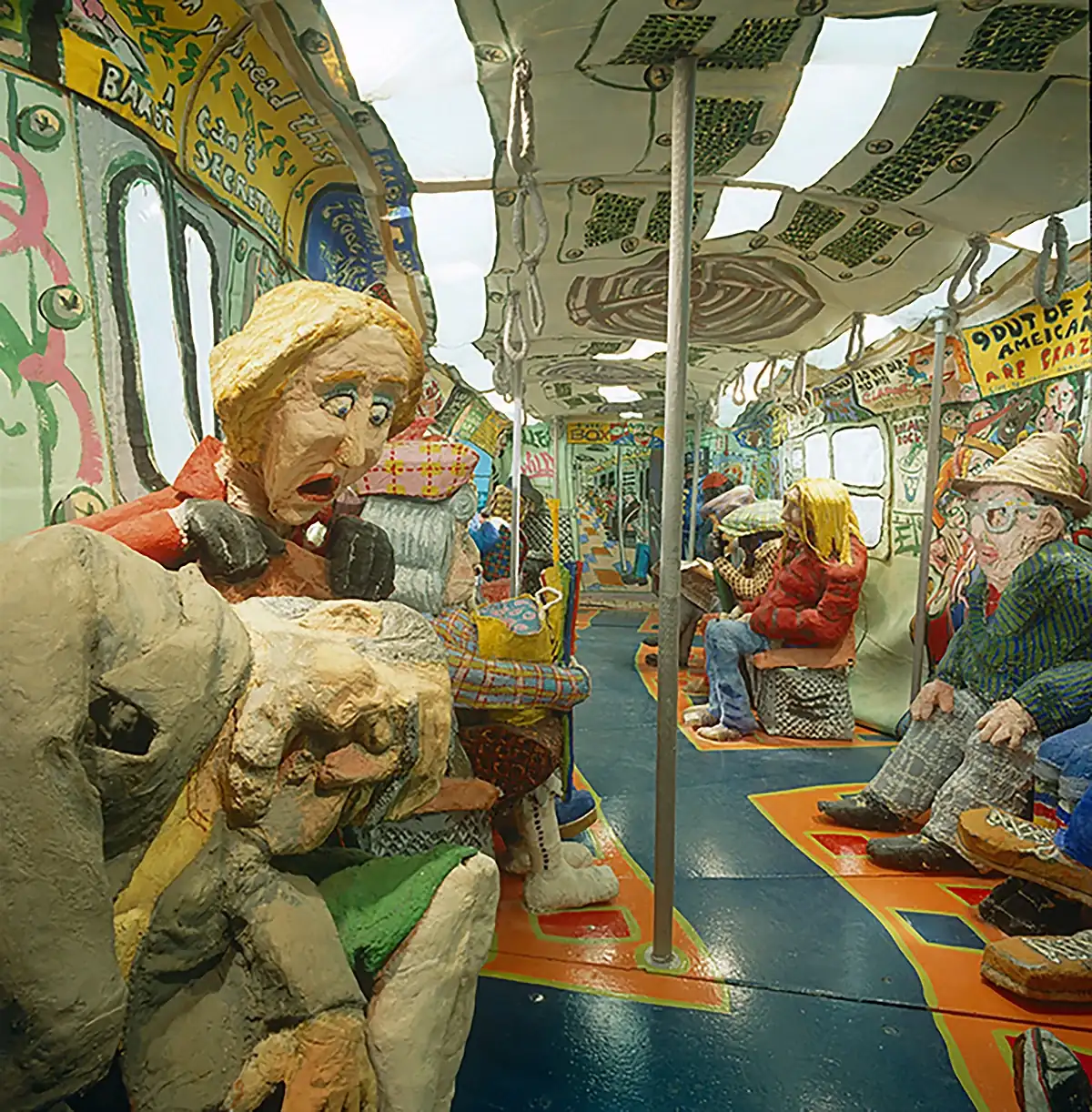
Ruckus Manhattan: Subway, by Red Grooms, Mimi Gross and The Ruckus Construction Company, takes the discussion into a walk-in environment. Its inclusion matters because it shifts attention from a single character to a world organised around bodies. The museum’s documentation identifies the work and its makers; it should not be mistaken for an installation by KAWS simply because it appears in an exhibition bearing his name.
Look at a wide view before choosing a detail. A doorway, an aisle and the placement of figures suggest routes through the work. The image asks how someone might enter a scene, rather than how someone might hold an object. That distinction makes photographs of the environment worth grouping together: one establishes the whole arrangement, another can show a face or a deliberately exaggerated feature. A sequence preserves the relationship between those views. A solitary cropped detail risks turning a place back into a collection of disconnected graphic motifs.
Keith Haring and the space between shop and museum
Keith Haring’s Pop Shop Tokyo brings another kind of environment into the conversation. In his FM4 interview with KAWS at the exhibition, Alexander “Phekt” Hertel describes an installation visitors could enter. The shop’s presence is useful for thinking about where an image meets its audience: on a wall, around a room or on something a person takes home.
Those situations do not require identical judgements. A museum work and a wearable object have different uses, different viewing distances and different forms of attention. They can still share a visual language. For a collector, the more productive question is what a particular object allows them to notice, rather than whether a commercial format automatically makes it less serious. Our history of KAWS and BE@RBRICK approaches another part of this relationship through specific collaborations. The Vienna exhibition offers a broader setting in which to consider it, without turning every object into an argument about market value.
KAWS appears on both sides of the collection
KAWS was also a lender to the exhibition. The museum identifies Peter Saul’s The Government of California as part of his collection. That small line in a caption changes the relationship between the names in the room: one artist is looking at, choosing and living with another artist’s work. The connection is more tangible than a general claim that everyone shares an interest in popular culture.
For a reader building a collection, this is perhaps the most useful thread to follow. A collection can form around a problem, a gesture or a visual habit rather than a single artist’s name. It can place a precise contour next to an unruly one, or a quiet body next to a noisy picture. That is a way to think about selection, not a shopping formula. The objects need enough difference to keep each other interesting. A wall of perfectly matching colours may be harmonious while leaving relatively little to discover after the first glance.
Photographs
What remains useful after the exhibition closes
An exhibition review can outlive the ticket calendar if it preserves a way of looking. In this case, the lasting questions are straightforward: what does a character communicate before we know its name, how does size affect that communication, and what changes when an image becomes a place? The answers need not be final. A return to the same photograph may reveal that the painting, rather than the sculpture in front of it, holds the entire scene together.
The archived exhibition listing records the closing date, so this is an account to read rather than a recommendation for a current visit. For bringing some of these ideas into an everyday room, our guide to art toys at home considers display and space. The valuable lesson is to give an object enough context to be seen properly. That may mean a second view, a carefully chosen neighbour or simply some room around a familiar figure.